Multilevel linear models in Stata, part 1: Components of variance
In the last 15-20 years multilevel modeling has evolved from a specialty area of statistical research into a standard analytical tool used by many applied researchers.
Stata has a lot of multilevel modeling capababilities.
I want to show you how easy it is to fit multilevel models in Stata. Along the way, we’ll unavoidably introduce some of the jargon of multilevel modeling.
I’m going to focus on concepts and ignore many of the details that would be part of a formal data analysis. I’ll give you some suggestions for learning more at the end of the post.
- The videos
Stata has a friendly dialog box that can assist you in building multilevel models. If you would like a brief introduction using the GUI, you can watch a demonstration on Stata’s YouTube Channel:
Introduction to multilevel linear models in Stata, part 1: The xtmixed command
- Multilevel data
Multilevel data are characterized by a hierarchical structure. A classic example is children nested within classrooms and classrooms nested within schools. The test scores of students within the same classroom may be correlated due to exposure to the same teacher or textbook. Likewise, the average test scores of classes might be correlated within a school due to the similar socioeconomic level of the students.
You may have run across datasets with these kinds of structures in your own work. For our example, I would like to use a dataset that has both longitudinal and classical hierarchical features. You can access this dataset from within Stata by typing the following command:
use http://www.stata-press.com/data/r12/productivity.dta
We are going to build a model of gross state product for 48 states in the USA measured annually from 1970 to 1986. The states have been grouped into nine regions based on their economic similarity. For distributional reasons, we will be modeling the logarithm of annual Gross State Product (GSP) but in the interest of readability, I will simply refer to the dependent variable as GSP.
. describe gsp year state region

              storage  display     value
variable name   type   format      label      variable label
-----------------------------------------------------------------------------
gsp             float  %9.0g                  log(gross state product)
year            int    %9.0g                  years 1970-1986
state           byte   %9.0g                  states 1-48
region          byte   %9.0g                  regions 1-9
Let’s look at a graph of these data to see what we’re working with.
twoway (line gsp year, connect(ascending)), ///
        by(region, title("log(Gross State Product) by Region", size(medsmall)))
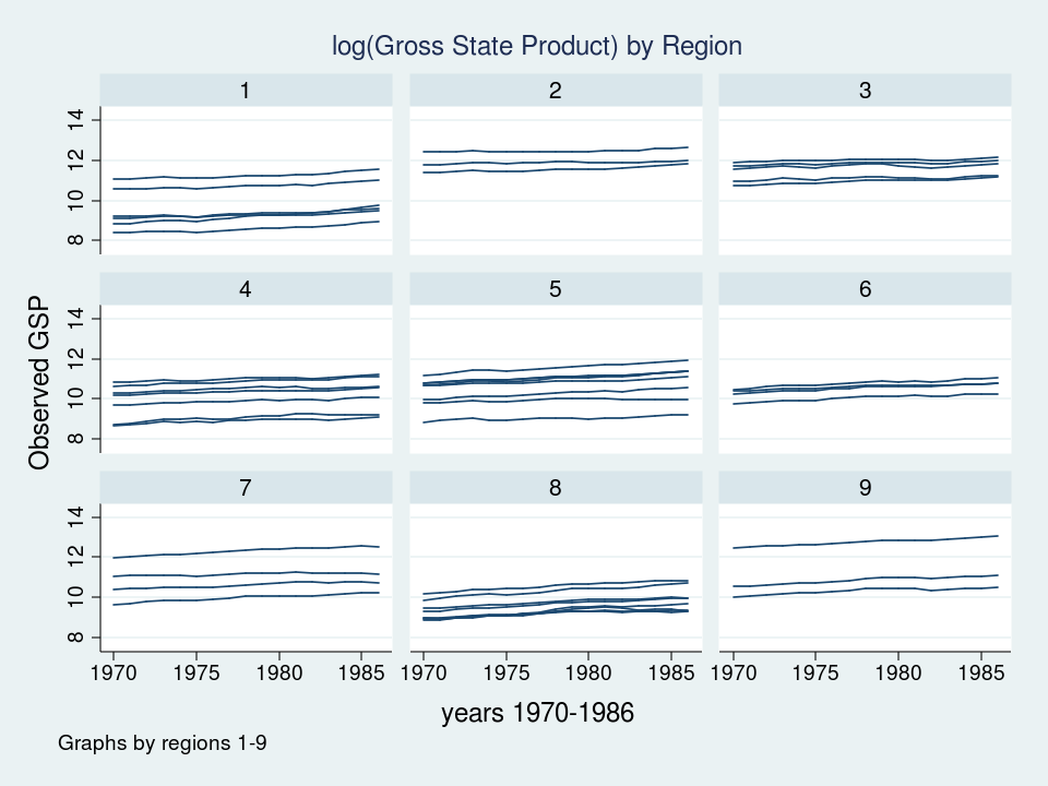
Each line represents the trajectory of a state’s (log) GSP over the years 1970 to 1986. The first thing I notice is that the groups of lines are different in each of the nine regions. Some groups of lines seem higher and some groups seem lower. The second thing that I notice is that the slopes of the lines are not the same. I’d like to incorporate those attributes of the data into my model.
- Components of variance
Let’s tackle the vertical differences in the groups of lines first. If we think about the hierarchical structure of these data, I have repeated observations nested within states which are in turn nested within regions. I used color to keep track of the data hierarchy.
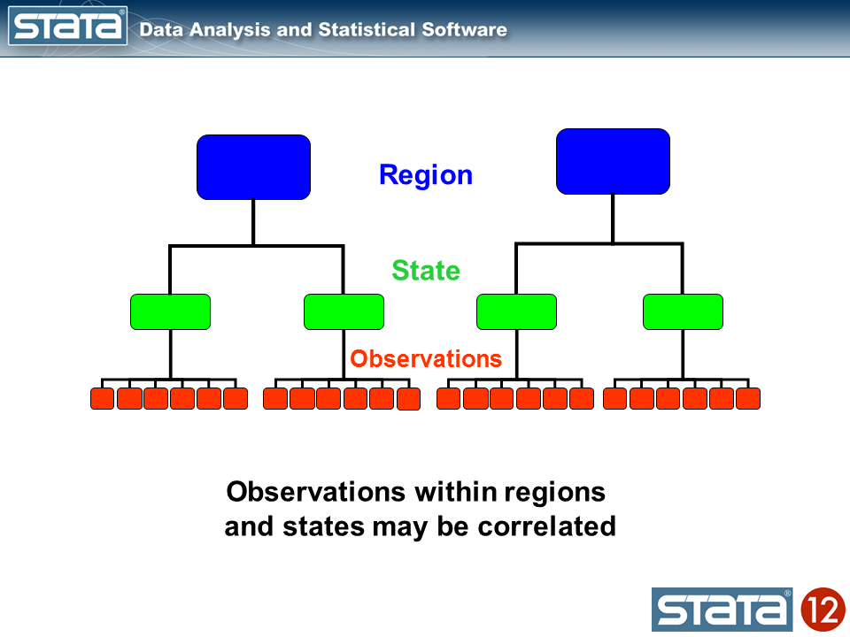
We could compute the mean GSP within each state and note that the observations within in each state vary about their state mean.

Likewise, we could compute the mean GSP within each region and note that the state means vary about their regional mean.

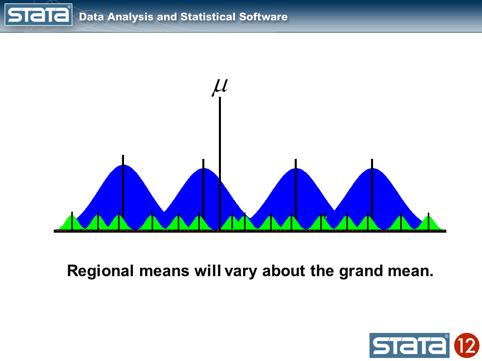
We could also compute a grand mean and note that the regional means vary about the grand mean.
Next, let’s introduce some notation to help us keep track of our mutlilevel structure. In the jargon of multilevel modelling, the repeated measurements of GSP are described as “level 1”, the states are referred to as “level 2” and the regions are “level 3”. I can add a three-part subscript to each observation to keep track of its place in the hierarchy.

Now let’s think about our model. The simplest regression model is the intercept-only model which is equivalent to the sample mean. The sample mean is the “fixed” part of the model and the difference between the observation and the mean is the residual or “random” part of the model. Econometricians often prefer the term “disturbance”. I’m going to use the symbol μ to denote the fixed part of the model. μ could represent something as simple as the sample mean or it could represent a collection of independent variables and their parameters.
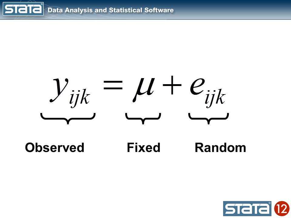
Each observation can then be described in terms of its deviation from the fixed part of the model.
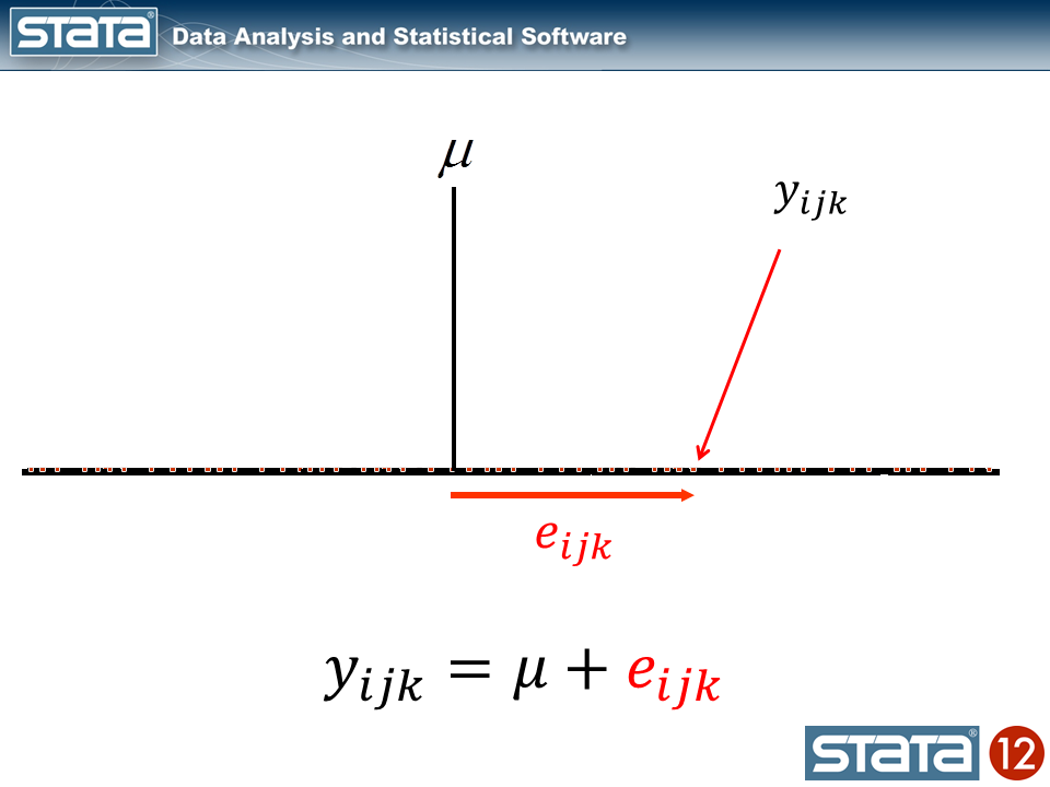
If we computed this deviation of each observation, we could estimate the variability of those deviations. Let’s try that for our data using Stata’s xtmixed command to fit the model:
. xtmixed gsp

Mixed-effects ML regression                     Number of obs      =       816

                                                Wald chi2(0)       =         .
Log likelihood = -1174.4175                     Prob > chi2        =         .

------------------------------------------------------------------------------
         gsp |      Coef.   Std. Err.      z    P>|z|     [95% Conf. Interval]
-------------+----------------------------------------------------------------
       _cons |   10.50885   .0357249   294.16   0.000     10.43883    10.57887
------------------------------------------------------------------------------

------------------------------------------------------------------------------
  Random-effects Parameters  |   Estimate   Std. Err.     [95% Conf. Interval]
-----------------------------+------------------------------------------------
                sd(Residual) |   1.020506   .0252613      .9721766    1.071238
------------------------------------------------------------------------------
The top table in the output shows the fixed part of the model which looks like any other regression output from Stata, and the bottom table displays the random part of the model. Let’s look at a graph of our model along with the raw data and interpret our results.
predict GrandMean, xb
label var GrandMean "GrandMean"
twoway  (line GrandMean year, lcolor(black) lwidth(thick))              ///
        (scatter gsp year, mcolor(red) msize(tiny)),                    ///
        ytitle(log(Gross State Product), margin(medsmall))              ///
        legend(cols(4) size(small))                                     ///
        title("GSP for 1970-1986 by Region", size(medsmall))
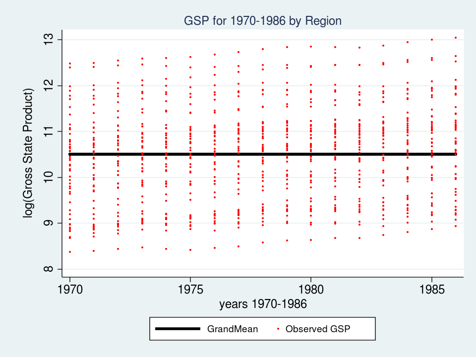
The thick black line in the center of the graph is the estimate of _cons, which is an estimate of the fixed part of model for GSP. In this simple model, _cons is the sample mean which is equal to 10.51. In “Random-effects Parameters” section of the output, sd(Residual) is the average vertical distance between each observation (the red dots) and fixed part of the model (the black line). In this model, sd(Residual) is the estimate of the sample standard deviation which equals 1.02.
At this point you may be thinking to yourself – “That’s not very interesting – I could have done that with Stata’s summarize command”. And you would be correct.
. summ gsp

    Variable |       Obs        Mean    Std. Dev.       Min        Max
-------------+--------------------------------------------------------
         gsp |       816    10.50885    1.021132    8.37885   13.04882
But here’s where it does become interesting. Let’s make the random part of the model more complex to account for the hierarchical structure of the data. Consider a single observation, yijk and take another look at its residual.
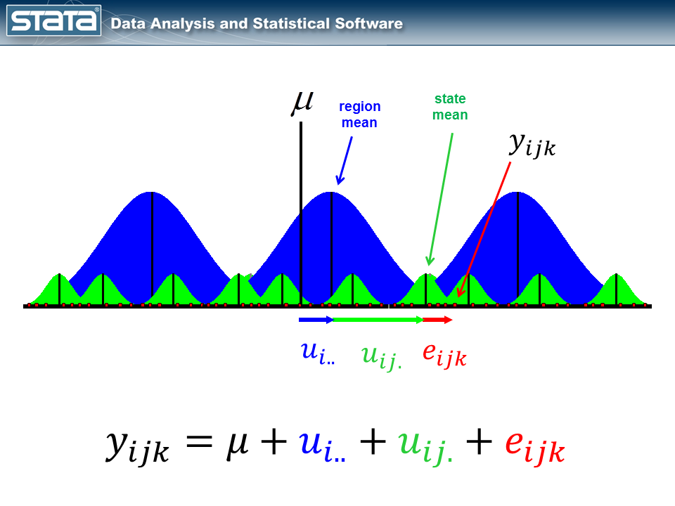
The observation deviates from its state mean by an amount that we will denote eijk. The observation’s state mean deviates from the the regionals mean uij. and the observation’s regional mean deviates from the fixed part of the model, μ, by an amount that we will denote ui... We have partitioned the observation’s residual into three parts, aka “components”, that describe its magnitude relative to the state, region and grand means. If we calculated this set of residuals for each observation, wecould estimate the variability of those residuals and make distributional assumptions about them.
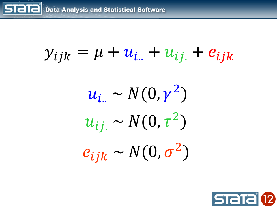
These kinds of models are often called “variance component” models because they estimate the variability accounted for by each level of the hierarchy. We can estimate a variance component model for GSP using Stata’s xtmixed command:
xtmixed gsp, || region: || state:

------------------------------------------------------------------------------
         gsp |      Coef.   Std. Err.      z    P>|z|     [95% Conf. Interval]
-------------+----------------------------------------------------------------
       _cons |   10.65961   .2503806    42.57   0.000     10.16887    11.15035
------------------------------------------------------------------------------

------------------------------------------------------------------------------
  Random-effects Parameters  |   Estimate   Std. Err.     [95% Conf. Interval]
-----------------------------+------------------------------------------------
region: Identity             |
                   sd(_cons) |   .6615227   .2038944       .361566    1.210325
-----------------------------+------------------------------------------------
state: Identity              |
                   sd(_cons) |   .7797837   .0886614      .6240114    .9744415
-----------------------------+------------------------------------------------
                sd(Residual) |   .1570457   .0040071       .149385    .1650992
------------------------------------------------------------------------------
The fixed part of the model, _cons, is still the sample mean. But now there are three parameters estimates in the bottom table labeled “Random-effects Parameters”. Each quantifies the average deviation at each level of the hierarchy.
Let’s graph the predictions from our model and see how well they fit the data.
predict GrandMean, xb
label var GrandMean "GrandMean"
predict RegionEffect, reffects level(region)
predict StateEffect, reffects level(state)
gen RegionMean = GrandMean + RegionEffect
gen StateMean = GrandMean + RegionEffect + StateEffect

twoway  (line GrandMean year, lcolor(black) lwidth(thick))      ///
        (line RegionMean year, lcolor(blue) lwidth(medthick))   ///
        (line StateMean year, lcolor(green) connect(ascending)) ///
        (scatter gsp year, mcolor(red) msize(tiny)),            ///
        ytitle(log(Gross State Product), margin(medsmall))      ///
        legend(cols(4) size(small))                             ///
        by(region, title("Multilevel Model of GSP by Region", size(medsmall)))
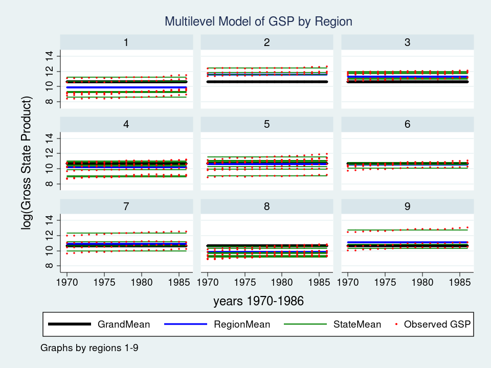
Wow – that’s a nice graph if I do say so myself. It would be impressive for a report or publication, but it’s a little tough to read with all nine regions displayed at once. Let’s take a closer look at Region 7 instead.
twoway  (line GrandMean year, lcolor(black) lwidth(thick))      ///
        (line RegionMean year, lcolor(blue) lwidth(medthick))   ///
        (line StateMean year, lcolor(green) connect(ascending)) ///
        (scatter gsp year, mcolor(red) msize(medsmall))         ///
        if region ==7,                                          ///
        ytitle(log(Gross State Product), margin(medsmall))      ///
        legend(cols(4) size(small))                             ///
        title("Multilevel Model of GSP for Region 7", size(medsmall))

The red dots are the observations of GSP for each state within Region 7. The green lines are the estimated mean GSP within each State and the blue line is the estimated mean GSP within Region 7. The thick black line in the center is the overall grand mean for all nine regions. The model appears to fit the data fairly well but I can’t help noticing that the red dots seem to have an upward slant to them. Our model predicts that GSP is constant within each state and region from 1970 to 1986 when clearly the data show an upward trend.
So we’ve tackled the first feature of our data. We’ve succesfully incorporated the basic hierarchical structure into our model by fitting a variance componentis using Stata’s xtmixed command. But our graph tells us that we aren’t finished yet.
Next time we’ll tackle the second feature of our data — the longitudinal nature of the observations.
- For more information
If you’d like to learn more about modelling multilevel and longitudinal data, check out
Multilevel and Longitudinal Modeling Using Stata, Third Edition
Volume I: Continuous Responses
Volume II: Categorical Responses, Counts, and Survival
by Sophia Rabe-Hesketh and Anders Skrondal
or sign up for our popular public training course “Multilevel/Mixed Models Using Stata“.
There’s a course coming up in Washington, DC on February 7-8, 2013.