Stata Press is pleased to announce the release of A Visual Guide to Stata Graphics, Fourth Edition by Michael N. Mitchell. This book debuted as Kindle’s #1 New Release in the category Mathematical & Statistical and continues to appear on Kindle’s best-seller list in numerous categories, including Educational Software and Education Statistics. Read more…
Categories: Graphics, New Books, Resources, Stata Products Tags: books, forthcoming, graphics, graphs, introduction, michael mitchell, mitchell, release, Stata 17, stata press
Introduction
Sometimes, I like to augment a time-series graph with shading that indicates periods of recession. In this post, I will show you a simple way to add recession shading to graphs using data provided by import fred. This post also demostrates how to build a complex graph in Stata, beginning with the basic pieces and finishing with a polished product.
Read more…
You want a graph that most effectively communicates your message. You want a graph that fits the style of your journal. You want a graph with colors that everyone can differentiate. Or you want a graph in grayscale. Read more…
This post shows how to create animated graphics that illustrate the spatial spillover effects generated by a spatial autoregressive (SAR) model. After reading this post, you could create an animated graph like the following.
This post is organized as follows. First, I estimate the parameters of a SAR model. Second, I show why a SAR model can produce spatial spillover effects. Finally, I show how to create an animated graph that illustrates the spatial spillover effects. Read more…
We announced Stata 15 today. It’s a big deal because this is Stata’s biggest release ever.
I posted to Statalist this morning and listed sixteen of the most important new features. Here on the blog I will say more about them, and you can learn even more by visiting our website and seeing the Stata 15 features page.
I go into depth below on the sixteen highlighted features. They are (click to jump)
Read more…
Introduction
Today I want to show you how to create animated graphics using Stata. It’s easier than you might expect and you can use animated graphics to illustrate concepts that would be challenging to illustrate with static graphs. In addition to Stata, you will need a video editing program but don’t be concerned if you don’t have one. At the 2012 UK Stata User Group Meeting Robert Grant demonstrated how to create animated graphics from within Stata using a free software program called FFmpeg. I will show you how I create my animated graphs using Camtasia and how Robert creates his using FFmpeg. Read more…
Jim Hufford, Esq. had his first Stata lesson: “This is going to be awesome when I understand what all those little letters and things mean.”
Along those lines—awesome—Jim may want to see these nice Stata scatterplots from the “wannabe economists of the Graduate Institute of International and Development Studies in Geneva” at Rigotnomics.
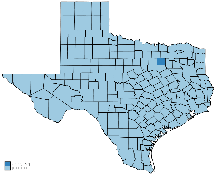
If you want to graph data onto maps using Stata—and see another awesome graph—see Mitch Abdon’s “Fun with maps in Stata” over at the Stata Daily.
And if you’re interested in geocoding to obtain latitudes and longitudes from human-readable addresses or locations, see Adam Ozimek’s “Computers are taking our jobs: Stata nerds only edition” over at Modeled Behavior and see the related Stata Journal article “Stata utilities for geocoding and generating travel time and travel distance information” by Adam Ozimek and Daniel Miles.