Stata/Python integration part 5: Three-dimensional surface plots of marginal predictions
In my first four posts about Stata and Python, I showed you how to set up Stata to use Python, three ways to use Python in Stata, how to install Python packages, and how to use Python packages. It might be helpful to read those posts before you continue with this post if you are not familiar with Python. Now, I’d like to shift our focus to some practical uses of Python within Stata. This post will demonstrate how to use Stata to estimate marginal predictions from a logistic regression model and use Python to create a three-dimensional surface plot of those predictions.
We will be using the NumPy, pandas, and Matplotlib packages, so you should check that they are installed before we begin.
Predicted probabilities for continuous-by-continuous interactions
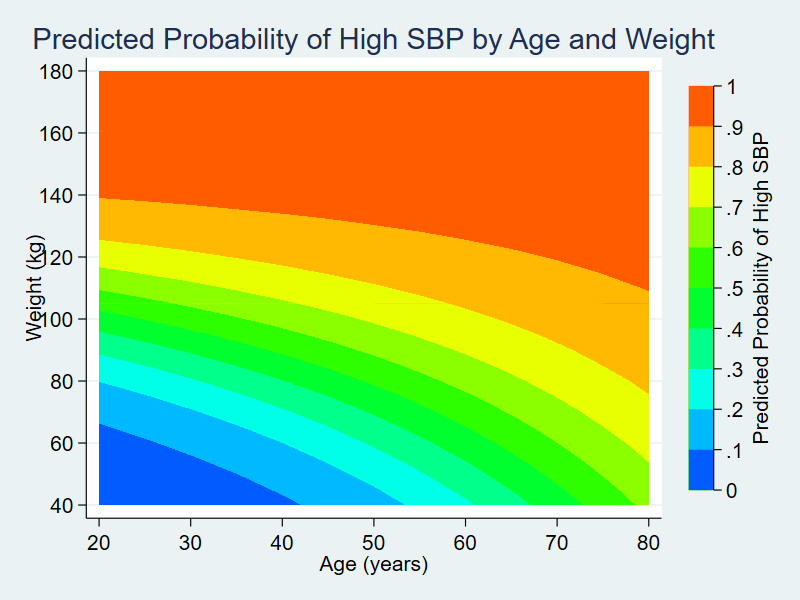
Several years ago, I wrote a Stata News article titled Visualizing continuous-by-continuous interactions with margins and twoway contour. In that article, I fit a logistic regression model using data from the National Health and Nutrition Examination Survey (NHANES). The dependent variable, highbp, is an indicator for high blood pressure, and I included the main effects and interaction of the continuous variables age and weight.
. webuse nhanes2, clear

. svy: logistic highbp c.age##c.weight
(running logistic on estimation sample)

Survey: Logistic regression

Number of strata   =        31                Number of obs     =       10,351
Number of PSUs     =        62                Population size   =  117,157,513
                                              Design df         =           31
                                              F(   3,     29)   =       418.97
                                              Prob > F          =       0.0000

--------------------------------------------------------------------------------
               |             Linearized
        highbp | Odds Ratio   Std. Err.      t    P>|t|     [95% Conf. Interval]
---------------+----------------------------------------------------------------
           age |   1.100678   .0088786    11.89   0.000     1.082718    1.118935
        weight |    1.07534   .0063892    12.23   0.000     1.062388     1.08845
               |
c.age#c.weight |   .9993975   .0001138    -5.29   0.000     .9991655    .9996296
               |
         _cons |   .0002925   .0001194   -19.94   0.000     .0001273    .0006724
--------------------------------------------------------------------------------
Note: _cons estimates baseline odds.
The estimated odds ratio for the interaction of age and weight is 0.9994, and the p-value for the estimate is 0.000. Interpreting this result is challenging because the odds ratio is essentially equal to the null value of one, but the p-value is essentially zero. Is the interaction effect meaningful? It is often easier to determine this by looking at the predicted probability of the outcome at different levels of the covariates rather than looking only at this odds ratio.
The code block below uses margins to estimate the predicted probability of hypertension for all combinations of age and weight for values of age ranging from 20 to 80 years in increments of 5 and for values of weight ranging from 40 to 180 kilograms in increments of 5. The option saving(predictions, replace) saves the predictions to a dataset named predictions.dta. I then use the dataset predictions, rename three variables in the dataset, and save it again.
webuse nhanes2, clear

svy: logistic highbp age weight c.age#c.weight

quietly margins, at(age=(20(5)80) weight=(40(5)180))             ///

vce(unconditional) saving(predictions, replace)

use predictions, clear

rename _at1 age

rename _at2 weight

rename _margin pr_highbp

save predictions, replace
In my previous Stata News article, I used graph twoway contour to create a contour plot of the predicted probabilities of hypertension.

In this post, I’m going to use Python to create a three-dimensional surface plot of the predicted probabilities.
Using pandas to read the marginal predictions into Python
Python must have access to the data stored in predictions.dta to create our three-dimensional surface plot. Let’s begin by importing the pandas package into Python using the alias pd. We can then use the read_stata() method in the pandas package to read predictions.dta into a pandas data frame named data.
. python:
-------------------------------------------- python (type end to exit) --------
>>> import pandas as pd
>>> data = pd.read_stata("predictions.dta")
>>> data
     pr_highbp  age  weight
0     0.020091   20      40
1     0.027450   20      45
2     0.037401   20      50
3     0.050771   20      55
4     0.068580   20      60
..         ...  ...     ...
372   0.954326   80     160
373   0.958618   80     165
374   0.962523   80     170
375   0.966072   80     175
376   0.969296   80     180

[377 rows x 3 columns]
>>> end
--------------------------------------------------------------------------------
We can then refer to a variable within the data frame by typing dataframe[‘varname‘]. For example, we could refer to the variable age in the data frame data by typing data[‘age’].
. python:
-------------------------------------------- python (type end to exit) --------
>>> import pandas as pd
>>> data = pd.read_stata("predictions.dta")
>>> data['age']
0      20
1      20
2      20
3      20
4      20
       ..
372    80
373    80
374    80
375    80
376    80
Name: age, Length: 377, dtype: int8
>>> end
-------------------------------------------------------------------------------
We can refer to multiple variables within a data frame by typing dataframe[[‘varname1‘, ‘varname2‘]]. For example, we could refer to the variables age and weight in the data frame data by typing data[[‘age’, ‘weight’]].
. python:
-------------------------------------------- python (type end to exit) --------
>>> import pandas as pd
>>> data = pd.read_stata("predictions.dta")
>>> data[['age', 'weight']]
     age  weight
0     20      40
1     20      45
2     20      50
3     20      55
4     20      60
..   ...     ...
372   80     160
373   80     165
374   80     170
375   80     175
376   80     180

[377 rows x 2 columns]
>>> end
-------------------------------------------------------------------------------
Using NumPy to create lists of numbers
We will also need to create lists of numbers to place ticks on the axes of our graph. Let’s import the NumPy package into Python using the alias np. We can then use the arange() method in the NumPy package to create lists. The example below creates a list of numbers named mylist beginning at 20 and ending at 90 in increments of 10.
. python:
-------------------------------------------- python (type end to exit) --------
>>> import numpy as np
>>> mylist = np.arange(20,90, step=10)
>>> mylist
array([20, 30, 40, 50, 60, 70, 80])
>>> end
-------------------------------------------------------------------------------
You may be surprised that the resulting list does not include the number 90. This is not a bug or a mistake. It is a feature of the arange() method in NumPy. You can type np.arange(20,100, step=10) if you wish to include 90 in your list.
Using Matplotlib to create three-dimensional surface plots
Now, we’re ready to create our plot. Let’s begin by importing the NumPy, pandas, and Matplotlib packages into Python.
python:

import numpy as np

import pandas as pd

import matplotlib

end
Let’s also import the pyplot module from the Matplotlib package using the alias plt. The new line is shown in red to make it easier to identify.
python:

import numpy as np

import pandas as pd

import matplotlib

import matplotlib.pyplot as plt

end
I have added the statement matplotlib.use(‘TkAgg’) to the code block below. I need this statement so that Matplotlib will run correctly using Python in my Windows 10 environment. Matplotlib uses different rendering engines for different purposes and for different platforms. You may need to use a different rendering engine in your computing environment, and you can learn more in the Stata FAQ titled “How do I use Matplotlib with Stata?“.
python:

import numpy as np

import pandas as pd

import matplotlib

import matplotlib.pyplot as plt

matplotlib.use('TkAgg')

end
Next, we can use the read_stata() method in the pandas package to read predictions.dta into a pandas data frame named data.
python:

import numpy as np

import pandas as pd

import matplotlib

import matplotlib.pyplot as plt

matplotlib.use('TkAgg')

data = pd.read_stata("predictions.dta")

end
Then, we can use the axes() method in the pyplot module to define a three-dimensional set of axes named ax.
python:

import numpy as np

import pandas as pd

import matplotlib

import matplotlib.pyplot as plt

matplotlib.use('TkAgg')

data = pd.read_stata("predictions.dta")

ax = plt.axes(projection='3d')

end
Next, we can use the plot_trisurf() method in the pyplot module to render our three-dimensional surface plot.
python:

import numpy as np

import pandas as pd

import matplotlib

import matplotlib.pyplot as plt

matplotlib.use('TkAgg')

data = pd.read_stata("predictions.dta")

ax = plt.axes(projection='3d')

ax.plot_trisurf(data['age'], data['weight'], data['pr_highbp'])

end
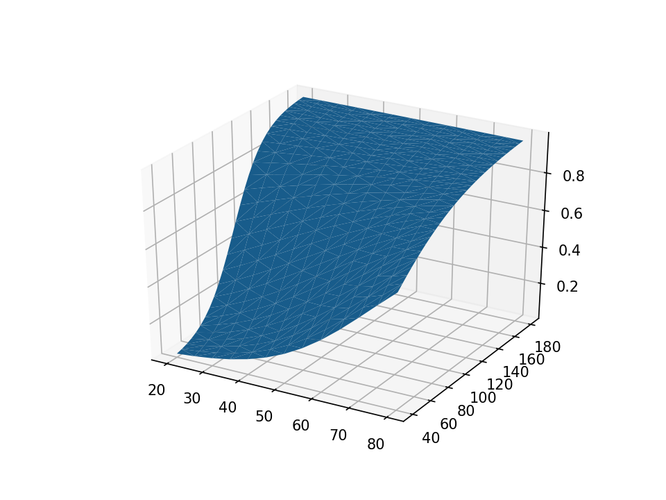
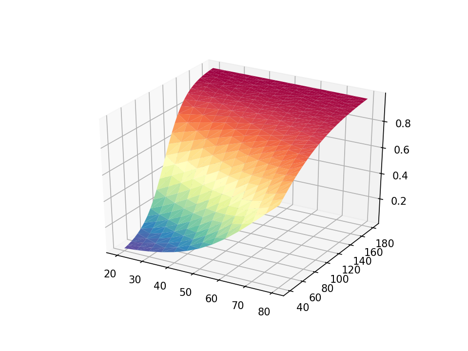
The surface plot is rendered with solid blue by default. Let’s use the cmap=plt.cm.Spectral_r option to add color shading to our plot. The color scheme Spectral_r displays lower probabilities of hypertension with blue and higher probabilities with red.
python:

import numpy as np

import pandas as pd

import matplotlib

import matplotlib.pyplot as plt

matplotlib.use('TkAgg')

data = pd.read_stata("predictions.dta")

ax = plt.axes(projection='3d')

ax.plot_trisurf(data['age'], data['weight'], data['pr_highbp'],

cmap=plt.cm.Spectral_r)

end
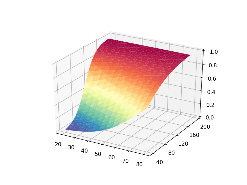
The default axis ticks look reasonable, but we may wish to customize them. The y axis looks somewhat cluttered, and we can modify the increment between ticks with the set_yticks() method in the axes module. The arange() method in the NumPy module defines a list of numbers from 40 to 200 in steps of 40. We can use similar statements to add custom tick marks to the x and z axes.
python:

import numpy as np

import pandas as pd

import matplotlib

import matplotlib.pyplot as plt

matplotlib.use('TkAgg')

data = pd.read_stata("predictions.dta")

ax = plt.axes(projection='3d')

ax.plot_trisurf(data['age'], data['weight'], data['pr_highbp'],

cmap=plt.cm.Spectral_r)

ax.set_xticks(np.arange(20,  90, step=10))

ax.set_yticks(np.arange(40, 200, step=40))

ax.set_zticks(np.arange( 0, 1.2, step=0.2))

end
Next, we can add a title to our graph with the set_title() method in the axes module. And we can add labels to the x, y, and z axes with the set_xlabel(), set_ylabel(), and set_zlabel() methods, respectively.
python:

import numpy as np

import pandas as pd

import matplotlib

import matplotlib.pyplot as plt

matplotlib.use('TkAgg')

data = pd.read_stata("predictions.dta")

ax = plt.axes(projection='3d')

ax.set_xticks(np.arange(20,  90, step=10))

ax.set_yticks(np.arange(40, 200, step=40))

ax.set_zticks(np.arange( 0, 1.2, step=0.2))

ax.set_title("Probability of Hypertension by Age and Weight")

ax.set_xlabel("Age (years)")

ax.set_ylabel("Weight (kg)")

ax.set_zlabel("Probability of Hypertension")

end
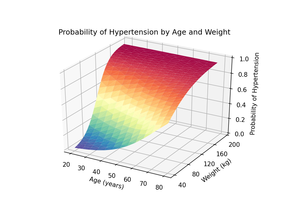
You can adjust the view angle using the view_init() method. The elev option adjusts the elevation, and the azim option adjusts the azimuth. Both are specified in degrees.
python:

import numpy as np

import pandas as pd

import matplotlib

import matplotlib.pyplot as plt

matplotlib.use('TkAgg')

data = pd.read_stata("predictions.dta")

ax = plt.axes(projection='3d')

ax.set_xticks(np.arange(20,  90, step=10))

ax.set_yticks(np.arange(40, 200, step=40))

ax.set_zticks(np.arange( 0, 1.2, step=0.2))

ax.set_title("Probability of Hypertension by Age and Weight")

ax.set_xlabel("Age (years)")

ax.set_ylabel("Weight (kg)")

ax.set_zlabel("Probability of Hypertension")

ax.view_init(elev=30, azim=240)

end

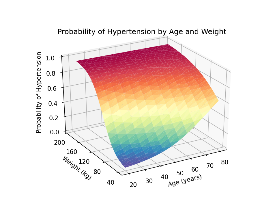
I would prefer to read the z-axis title from bottom to top rather than top to bottom. I can change this using a combination of the set_rotate_label(False) method and the rotation=90 option in the set_xlabel() method.
python:

import numpy as np

import pandas as pd

import matplotlib

import matplotlib.pyplot as plt

matplotlib.use('TkAgg')

data = pd.read_stata("predictions.dta")

ax = plt.axes(projection='3d')

ax.set_xticks(np.arange(20,  90, step=10))

ax.set_yticks(np.arange(40, 200, step=40))

ax.set_zticks(np.arange( 0, 1.2, step=0.2))

ax.set_title("Probability of Hypertension by Age and Weight")

ax.set_xlabel("Age (years)")

ax.set_ylabel("Weight (kg)")

ax.zaxis.set_rotate_label(False)

ax.set_zlabel("Probability of Hypertension", rotation=90)

ax.view_init(elev=30, azim=240)

end

Finally, we can use the savefig() method to save our graph as a portable network graphics (.png) file with 1200 dots-per-inch resolution.
python:

import numpy as np

import pandas as pd

import matplotlib

import matplotlib.pyplot as plt

matplotlib.use('TkAgg')

data = pd.read_stata("predictions.dta")

ax = plt.axes(projection='3d')

ax.set_xticks(np.arange(20,  90, step=10))

ax.set_yticks(np.arange(40, 200, step=40))

ax.set_zticks(np.arange( 0, 1.2, step=0.2))

ax.set_title("Probability of Hypertension by Age and Weight")

ax.set_xlabel("Age (years)")

ax.set_ylabel("Weight (kg)")

ax.zaxis.set_rotate_label(False)

ax.set_zlabel("Probability of Hypertension", rotation=90)

ax.view_init(elev=30, azim=240)

plt.savefig("Margins3d.png", dpi=1200)

end
Conclusion
The resulting three-dimensional surface plot shows the predicted probability of hypertension for values of age and weight. The probabilities are indicated by the height of the surface on the z axis and by the color of the surface. Blue indicates lower probabilities of hypertension, and red indicates higher probabilities of hypertension. This can be a useful way to interpret the interaction of two continuous covariates in a regression model.
I have collected the Stata commands and Python code block into a single do-file below. And I have included comments to remind you of the purpose of each collection of commands and statements. Note that Stata comments begin with “//”, and Python comments begin with “#”.
example.do
// Fit the model and estimate the marginal predicted probabilities with Stata

webuse nhanes2, clear

logistic highbp c.age##c.weight

quietly margins, at(age=(20(5)80) weight=(40(5)180)) ///

saving(predictions, replace)

use predictions, clear

rename _at1 age

rename _at2 weight

rename _margin pr_highbp

save predictions, replace
// Create the three-dimensional surface plot with Python

python:

# Import the necessary Python packages

import numpy as np

import pandas as pd

import matplotlib

import matplotlib.pyplot as plt

matplotlib.use('TkAgg')
# Read (import) the Stata dataset “predictions.dta”
# into a pandas data frame named “data”
data = pd.read_stata(“predictions.dta”)
# Define a 3-D graph named “ax”
ax = plt.axes(projection=’3d’)
# Render the graph
ax.plot_trisurf(data[‘age’], data[‘weight’], data[‘pr_highbp’],
cmap=plt.cm.Spectral_r)
# Specify the axis ticks
ax.set_xticks(np.arange(20, 90, step=10))
ax.set_yticks(np.arange(40, 200, step=40))
ax.set_zticks(np.arange( 0, 1.2, step=0.2))
# Specify the title and axis titles
ax.set_title(“Probability of Hypertension by Age and Weight”)
ax.set_xlabel(“Age (years)”)
ax.set_ylabel(“Weight (kg)”)
ax.zaxis.set_rotate_label(False)
ax.set_zlabel(“Probability of Hypertension”, rotation=90)
# Specify the view angle of the graph
ax.view_init(elev=30, azim=240)
# Save the graph

plt.savefig("Margins3d.png", dpi=1200)

end