How to create animated graphics using Stata
Introduction
Today I want to show you how to create animated graphics using Stata. It’s easier than you might expect and you can use animated graphics to illustrate concepts that would be challenging to illustrate with static graphs. In addition to Stata, you will need a video editing program but don’t be concerned if you don’t have one. At the 2012 UK Stata User Group Meeting Robert Grant demonstrated how to create animated graphics from within Stata using a free software program called FFmpeg. I will show you how I create my animated graphs using Camtasia and how Robert creates his using FFmpeg.
I recently recorded a video for the Stata Youtube channel called “Power and sample size calculations in Stata: A conceptual introduction“. I wanted to illustrate two concepts: (1) that statistcal power increases as sample size increases, and (2) as effect size increases. Both of these concepts can be illustrated with a static graph along with the explanation “imagine that …”. Creating animated graphs allowed me to skip the explanation and just show what I meant.
Creating the graphs
Videos are illusions. All videos — from Charles-Émile Reynaud’s 1877 praxinoscope to modern blu-ray movies — are created by displaying a series of ordered still images for a fraction of a second each. Our brains perceive this series of still images as motion.
To create the illusion of motion with graphs, we make an ordered series of slightly differing graphs. We can use loops to do this. If you are not familiar with loops in Stata, here’s one to count to five:
forvalues i = 1(1)5 {
    disp "i = `i'"
}

i = 1
i = 2
i = 3
i = 4
i = 5
We could place a graph command inside the loop. If, for each interation, the graph command created a slightly different graph, we would be on our way to creating our first video. The loop below creates a series of graphs of normal densities with means 0 through 1 in increments of 0.1.
forvalues mu = 0(0.1)1 {
    twoway  function y=normalden(x,`mu',1), range(-3 6) title("N(`mu',1)")
}
You may have noticed the illusion of motion as Stata created each graph; the normal densities appeared to be moving to the right as each new graph appeared on the screen.
You may have also noticed that some of the values of the mean did not look as you would have wanted. For example, 1.0 was displayed as 0.999999999. That’s not a mistake, it’s because Stata stores numbers and performs calculations in base two and displays them in base ten; for a detailed explanation, see Precision (yet again), Part I.
We can fix that by reformating the means using the string() function.
forvalues mu = 0(0.1)1 {
    local mu = string(`mu', "%3.1f")
    twoway  function y=normalden(x,`mu',1), range(-3 6) title("N(`mu',1)")
}
Next, we need to save our graphs. We can do this by adding graph export inside the loop.
forvalues mu = 0(0.1)1 {
    local mu = string(`mu', "%3.1f")
    twoway  function y=normalden(x,`mu',1), range(-3 6) title("N(`mu',1)")
    graph export graph_`mu'.png, as(png) width(1280) height(720) replace
}
Note that the name of each graph file includes the value of mu so that we know the order of our files. We can view the contents of the directory to verify that Stata has created a file for each of our graphs.
. ls
  <dir>   2/11/14 12:12  .
  <dir>   2/11/14 12:12  ..
  35.6k   2/11/14 12:11  graph_0.0.png
  35.6k   2/11/14 12:11  graph_0.1.png
  35.7k   2/11/14 12:11  graph_0.2.png
  35.7k   2/11/14 12:11  graph_0.3.png
  35.7k   2/11/14 12:11  graph_0.4.png
  35.8k   2/11/14 12:11  graph_0.5.png
  35.9k   2/11/14 12:12  graph_0.6.png
  35.7k   2/11/14 12:12  graph_0.7.png
  35.8k   2/11/14 12:12  graph_0.8.png
  35.9k   2/11/14 12:12  graph_0.9.png
  35.6k   2/11/14 12:12  graph_1.0.png
Now that we have created our graphs, we need to combine them into a video.
There are many commercial, freeware, and free software programs available that we could use. I will outline the basic steps using two of them, one a commerical GUI based product (not free) called Camtasia, and the other a free command-based program called FFmpeg.
Creating videos with Camtasia
Most commercial video editing programs have similar interfaces. The user imports image, sound and video files, organizes them in tracks on a timeline and then previews the resulting video. Camtasia is a commercial video program that I use to record videos for the Stata Youtube channel and its interface looks like this.
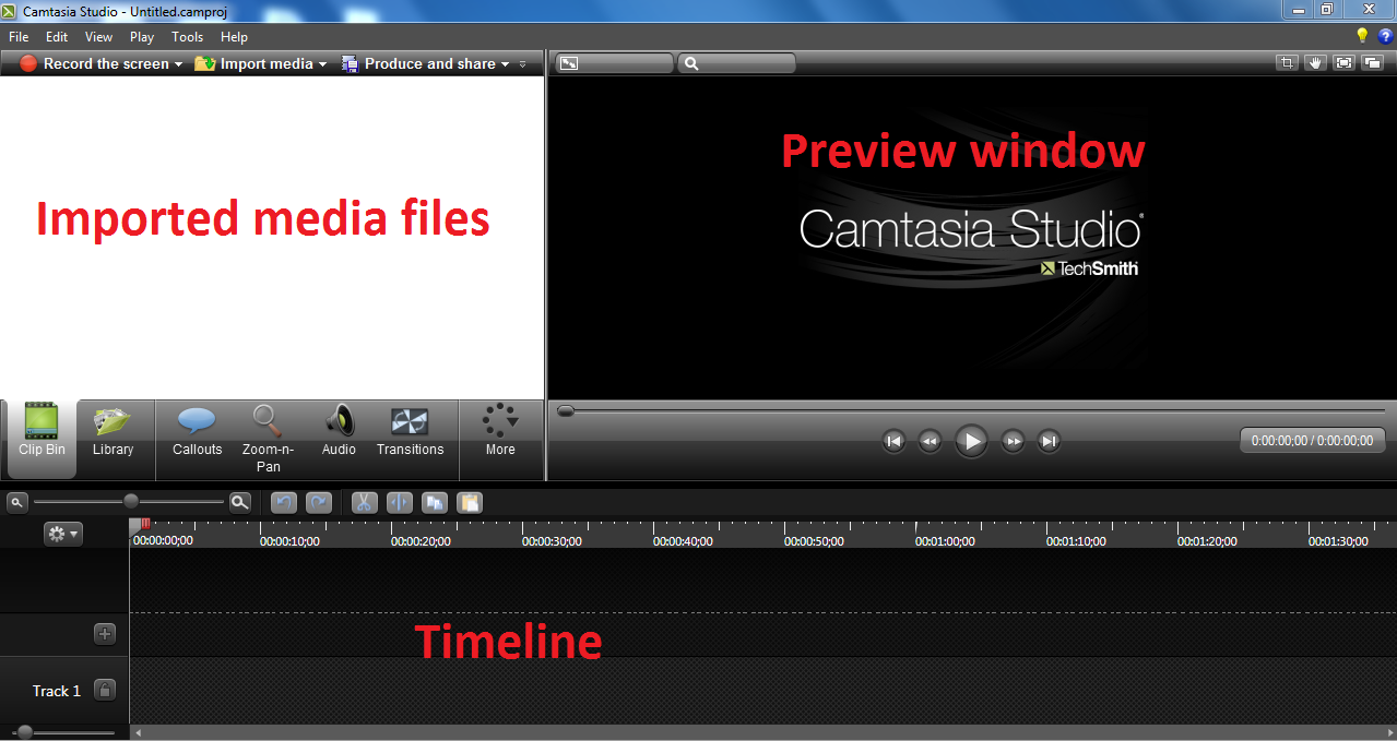
We begin by importing the graph files into Camtasia:
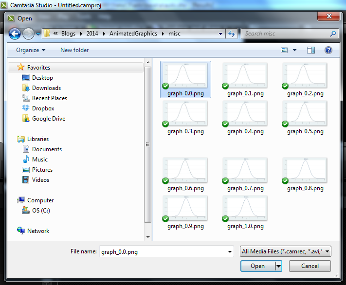
Next we drag the images onto the timeline:
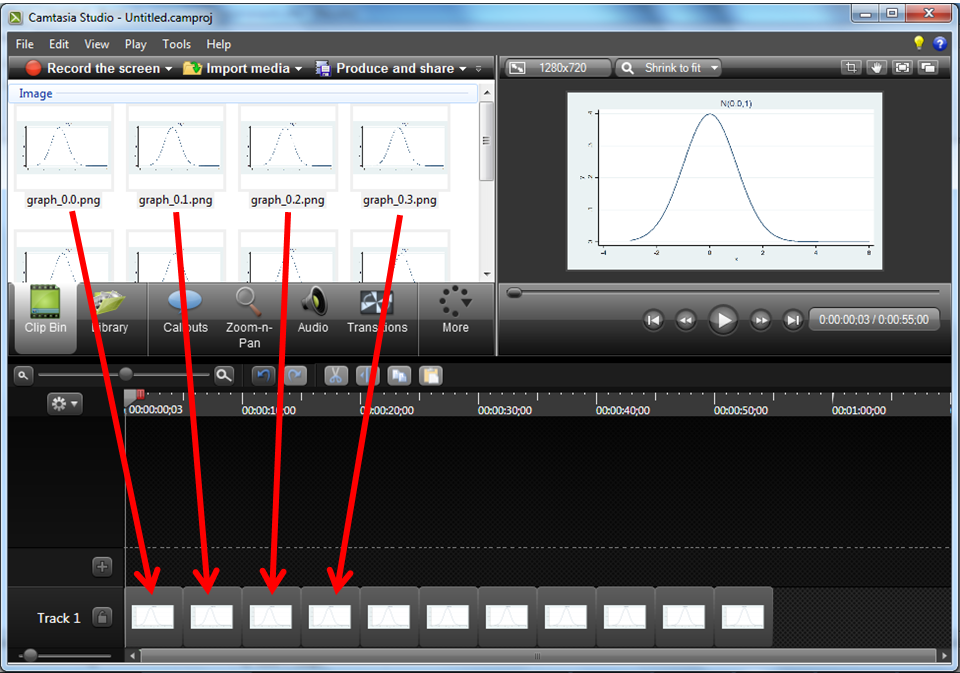
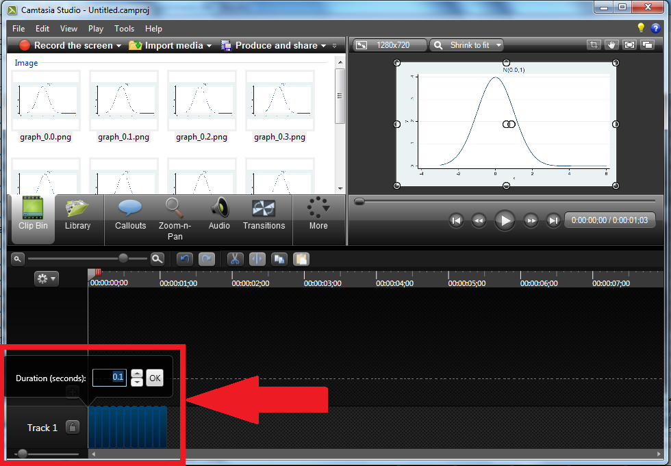
And then we make the display time for each image very short…in this case 0.1 seconds or 10 frames per second.
After previewing the video, we can export it to any of Camtasia’s supported formats. I’ve exported to a “.gif” file because it is easy to view in a web browser.
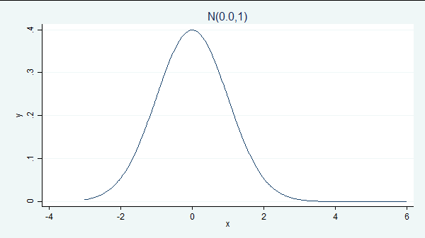
We just created our first animated graph! All we have to do to make it look as professional as the power-and-sample size examples I showed you earlier is go back into our Stata program and modify the graph command to add the additional elements we want to display!
Creating videos with FFmpeg
Stata user and medical statistician Robert Grant gave a presentation at the 2012 UK Stata User Group Meeting in London entitled “Producing animated graphs from Stata without having to learn any specialized software“. You can read more about Robert by visiting his blog and clicking on About.
In his presentation, Robert demonstrated how to combine graph images into a video using a free software program called FFmpeg. Robert followed the same basic strategy I demonstrated above, but Robert’s choice of software has two appealing features. First, the software is readily available and free. Second, FFmpeg can be called from within the Stata environment using the winexec command. This means that we can create our graphs and combine them into a video using Stata do files. Combining dozens or hundreds of graphs into a single video with a program is faster and easier than using a drag-and-drop interface.
Let’s return to our previous example and combine the files using FFmpeg. Recall that we inserted the mean into the name of each file (e.g. “graph_0.4.png”) so that we could keep track of the order of the files. In my experience, it can be difficult to combine files with decimals in their names using FFmpeg. To avoid the problem, I have added a line of code between the twoway command and the graph export command that names the files with sequential integers which are padded with zeros.
forvalues mu = 0(0.1)1 {
    local mu = string(`mu', "%3.1f")
    twoway function y=normalden(x,`mu',1), range(-3 6) title("N(`mu',1)")
    local mu = string(`mu'*10+1, "%03.0f")
    graph export graph_`mu'.png, as(png) width(1280) height(720) replace
}

. ls
  <dir>   2/12/14 12:21  .
  <dir>   2/12/14 12:21  ..
  35.6k   2/12/14 12:21  graph_001.png
  35.6k   2/12/14 12:21  graph_002.png
  35.7k   2/12/14 12:21  graph_003.png
  35.7k   2/12/14 12:21  graph_004.png
  35.7k   2/12/14 12:21  graph_005.png
  35.8k   2/12/14 12:21  graph_006.png
  35.9k   2/12/14 12:21  graph_007.png
  35.7k   2/12/14 12:21  graph_008.png
  35.8k   2/12/14 12:21  graph_009.png
  35.9k   2/12/14 12:21  graph_010.png
  35.6k   2/12/14 12:21  graph_011.png
We can then combine these files into a video with FFmpeg using the following commands
local GraphPath "C:\Users\jch\AnimatedGraphics\example\"
winexec "C:\Program Files\FFmpeg\bin\ffmpeg.exe" -i `GraphPath'graph_%03d.png
    -b:v 512k `GraphPath'graph.mpg
The local macro GraphPath contains the path for the directory where my graphics files are stored.
The Stata command winexec “whatever“ executes whatever. In our case, whatever is ffmpeg.exe, preceeded by ffmpeg.exe‘s path, and followed by the arguments FFmpeg needs. We specify two options, -i and -b.
The -i option is followed by a path and filename template. In our case, the path is obtained from the Stata local macro GraphPath and the filename template is “graph_%03d.png”. This template tells FFmpeg to look for a three digit sequence of numbers between “graph_” and “.png” in the filenames. The zero that precedes the three in the template tells FFmpeg that the three digit sequence of numbers is padded with zeros.
The -b option specifies the path and filename of the video to be created along with some attributes of the video.
Once we have created our video, we can use FFmpeg to convert our video to other video formats. For example, we could convert “graph.mpg” to “graph.gif” using the following command:
winexec "C:\Program Files\FFmpeg\bin\ffmpeg.exe" -r 10 -i `GraphPath'graph.mpg
    -t 10 -r 10 `GraphPath'graph.gif
which creates this graph:
FFmpeg is a very flexible program and there are far too many options to discuss in this blog entry. If you would like to learn more about FFmpeg you can visit their website at www.ffmpeg.org.
More Examples
I made the preceding examples as simple as possible so that we could focus on the mechanics of creating videos. We now know that, if we want to make professional looking videos, all the complication comes on the Stata side. We leave our loop alone but change the graph command inside it to be more complicated.
So here’s how I created the two animated-graphics videos that I used to create the overall video “Power and sample size calculations in Stata: A conceptual introduction” on our YouTube channel.
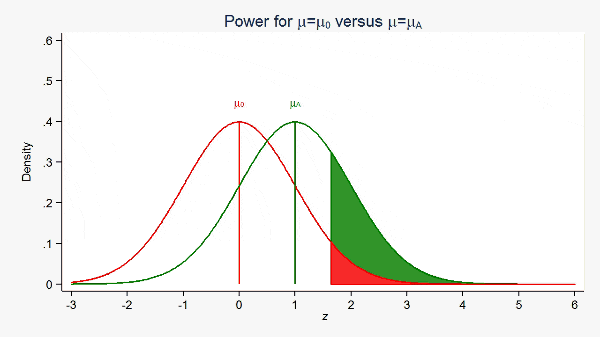
The first demonstrated that increasing the effect size (the difference between the means) results in increased statistical power.
local GraphCounter = 100
local mu_null = 0
local sd = 1
local z_crit = round(-1*invnormal(0.05), 0.01)
local z_crit_label = `z_crit' + 0.75

forvalues mu_alt = 1(0.01)3 {
  twoway  ///
    function y=normalden(x,`mu_null',`sd'),                    ///
             range(-3 `z_crit') color(red) dropline(0)   ||    ///
    function y=normalden(x,`mu_alt',`sd'),                     ///
             range(-3 5) color(green) dropline(`mu_alt') ||    ///
    function y=normalden(x,`mu_alt',`sd'),                     ///
             range(`z_crit' 6) recast(area) color(green) ||    ///
    function y=normalden(x,`mu_null',`sd'),                    ///
             range(`z_crit' 6) recast(area) color(red)         ///
    title("Power for {&mu}={&mu}{subscript:0} versus {&mu}={&mu}{subscript:A}") ///
    xtitle("{it: z}") xlabel(-3 -2 -1 0 1 2 3 4 5 6)           ///
    legend(off)                                                ///
    ytitle("Density") yscale(range(0 0.6))                     ///
    ylabel(0(0.1)0.6, angle(horizontal) nogrid)                ///
    text(0.45 0 "{&mu}{subscript:0}", color(red))              ///
    text(0.45 `mu_alt' "{&mu}{subscript:A}", color(green))

  graph export mu_alt_`GraphCounter'.png, as(png) width(1280) height(720) replace

  local ++GraphCounter
}
The above Stata code created the *.png files that I then combined using Camtasia to produce this gif:
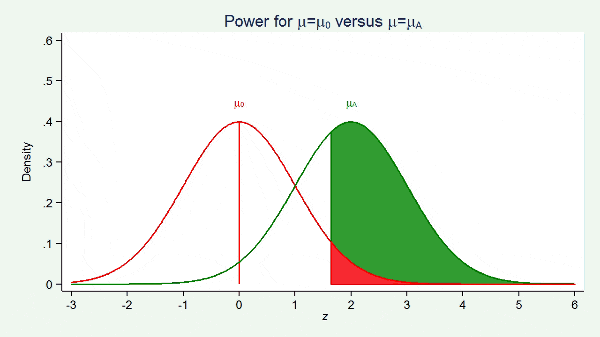
The second video demonstrated that power increases as the sample size increases.
local GraphCounter = 301
local mu_label = 0.45
local power_label = 2.10
local mu_null = 0
local mu_alt = 2

forvalues sd = 1(-0.01)0.5 {
  local z_crit = round(-1*invnormal(0.05)*`sd', 0.01)
  local z_crit_label = `z_crit' + 0.75

  twoway                                                                        ///
    function y=normalden(x,`mu_null',`sd'),                                     ///
             range(-3 `z_crit') color(red) dropline(0)  ||                      ///
    function y=normalden(x,`mu_alt',`sd'),                                      ///
             range(-3 5) color(green)  dropline(`mu_alt')      ||               ///
    function y=normalden(x,`mu_alt',`sd'),                                      ///
             range(`z_crit' 6) recast(area) color(green)       ||               ///
    function y=normalden(x,`mu_null',`sd'),                                     ///
             range(`z_crit' 6) recast(area) color(red)                          ///
    title("Power for {&mu}={&mu}{subscript:0} versus {&mu}={&mu}{subscript:A}") ///
    xtitle("{it: z}") xlabel(-3 -2 -1 0 1 2 3 4 5 6)                            ///
    legend(off)                                                                 ///
    ytitle("Density") yscale(range(0 0.6))                                      ///
    ylabel(0(0.1)0.6, angle(horizontal) nogrid)                                 ///
    text(`mu_label' 0 "{&mu}{subscript:0}", color(red))                         ///
    text(`mu_label' `mu_alt' "{&mu}{subscript:A}", color(green))
  graph export mu_alt_`GraphCounter'.png, as(png) width(1280) height(720) replace

  local ++GraphCounter
  local mu_label = `mu_label' + 0.005
  local power_label = `power_label' + 0.03
}
Just as previously, the above Stata code creates the *.png files that I then combine using Camtasia to produce a gif:
Let me show you some more examples.
The next example demonstrates the basic idea of lowess smoothing.
sysuse auto
local WindowWidth = 500
forvalues WindowUpper = 2200(25)5000 {
  local WindowLower = `WindowUpper' - `WindowWidth'
  twoway (scatter mpg weight)                                             ///
    (lowess mpg weight if weight < (`WindowUpper'-250), lcolor(green))    ///
    (lfit mpg weight if weight>`WindowLower' & weight<`WindowUpper',      ///
         lwidth(medium) lcolor(red))                                      ///
    , xline(`WindowLower' `WindowUpper', lwidth(medium) lcolor(black))    ///
    legend(on order(1 2 3) cols(3))
  graph export lowess_`WindowUpper'.png, as(png) width(1280) height(720) replace
}
The result is,
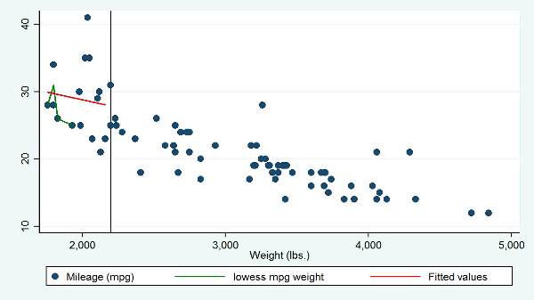
The animated graph I created is not yet a perfect analogy to what lowess actually does, but it comes close. It has two problems. The lowess curve changes outside of the sliding window, which it should not and the animation does not illustrate the weighting of the points within the window, say by using differently sized markers for the points in the sliding window. Even so, the graph does a far better job than the usual explanaton that one should imagine sliding a window across the scatterplot.
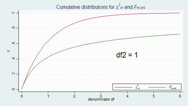
As yet another example, we can use animated graphs to demonstrate the concept of convergence. There is a FAQ on the Stata website written by Bill Gould that explains the relationship between the chi-squared and F distributions. The animated graph below shows that F(d1, d2) converges to d1*χ^2 as d2 goes to infinity:
forvalues df = 1(1)100 {
  twoway function  y=chi2(2,2*x), range(0 6) color(red) ||                                       ///
    function y=F(2,`df',x), range(0 6) color(green)                                              ///
    title("Cumulative distributions for {&chi}{sup:2}{sub:df} and {it:F}{subscript:df,df2}")     ///
    xtitle("{it: denominator df}") xlabel(0 1 2 3 4 5 6) legend(off)                             ///
    text(0.45 4 "df2 = `df'",  size(huge) color(black))                                          ///
    legend(on order(1 "{&chi}{sup:2}{sub:df}" 2 "{it:F}{subscript:df,df2}") cols(2) position(5) ring(0))

  local df = string(`df', "%03.0f")
  graph export converge2_`df'.png, as(png) width(1280) height(720) replace
}
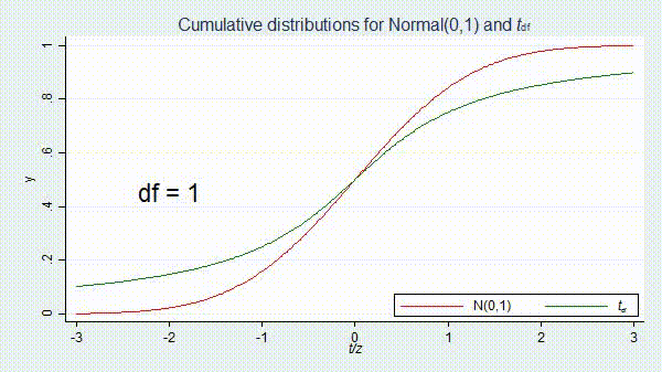
The t distribution has a similar relationship with the normal distribution.
forvalues df = 1(1)100 {
  twoway  function y=normal(x), range(-3 3) color(red)   ||                     ///
    function y=t(`df',x), range(-3 3) color(green)                              ///
    title("Cumulative distributions for Normal(0,1) and {it:t}{subscript:df}")  ///
    xtitle("{it: t/z}") xlabel(-3 -2 -1 0 1 2 3) legend(off)                    ///
    text(0.45 -2 "df = `df'",  size(huge) color(black))                         ///
    legend(on order(1 "N(0,1)" 2 "{it:t}{subscript:df}") cols(2) position(5) ring(0))

  local df = string(`df', "%03.0f")
  graph export converge_`df'.png, as(png) width(1280) height(720) replace
}
The result is
Final thoughts
I have learned through trial and error two things that improve the quality of my animated graphs. First, note that the axes of the graphs in most of the examples above are explicitly defined in the graph commands. This is often necessary to keep the axes stable from graph to graph. Second, videos have a smoother, higher quality appearance when there are many graphs with very small changes from graph to graph.
I hope I have convinced you that creating animated graphics with Stata is easier than you imagined. If the old saying that “a picture is worth a thousand words” is true, imagine how many words you can save using animated graphs.
Other resources
Relationship between chi-squared and F distributions