How to create animated graphics to illustrate spatial spillover effects
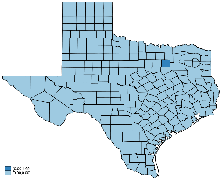
This post shows how to create animated graphics that illustrate the spatial spillover effects generated by a spatial autoregressive (SAR) model. After reading this post, you could create an animated graph like the following.
This post is organized as follows. First, I estimate the parameters of a SAR model. Second, I show why a SAR model can produce spatial spillover effects. Finally, I show how to create an animated graph that illustrates the spatial spillover effects.
A SAR model
I want to analyze the homicide rate in Texas counties as a function of unemployment. I suspect that the homicide rate in one county affects the homicide rate in neighboring counties.
I want to answer two questions.
-
How can I set up a model that explicitly allows the homicide rate in one county to depend on the homicide rate in neighboring counties?
-
Given my model, if the unemployment rate in Dallas increases to 10%, how would the homicide rate change in the neighboring counties of Dallas ?
Fit a SAR model
A standard linear model for the homicide rate in county \(i\) (\({\bf hrate}_i\)) as a function of the unemployment rate in that county’s \({\bf unemployment}_i\) is
\[\begin{align} {\bf hrate}_i = \beta_0 + \beta_1 {\bf unemployment}_{i} + \epsilon_i \end{align} \]
A SAR model allows \({\bf hrate}_i\) to depend on the homicide rate in neighboring counties. I need some new notation to write down a SAR model. I let \(W_{i,j}\) be a positive number if county \(j\) is a neighbor of county \(i\), zero if the \(j\) is not a neighbor of \(i\), and zero if \(j=i\), because no county can border itself.
Given this notation, a SAR model that allows the homicide rate in county \(i\) to depend on the homicide rate in neighboring counties can be written as
\[ \begin{align} {\bf hrate}_i = \gamma_1\sum_{j=1}^N W_{i,j} {\bf hrate}_{j} + \beta_1 {\bf unemployment}_{i} + \beta_0 + \epsilon_i \end{align} \]
where \(W_{i,j}\) defines the closeness between county \(i\) and county \(j\). The term \(\sum_{j=1}^N W_{i,j} {\bf hrate}_{j}\) is a weighted sum of the homicide rates in county \(i\)’s neighboring counties, and it specifies how the homicide rates in neighboring counties affect the homicide rate in county \(i\).
Stacking the neighborhood information in \(W_{i,j}\) for each county \(i\) produces a matrix \({\bf W}\) that records the neighbor information for each county \(i\). The matrix \({\bf W}\) is known as a spatial-weighting matrix.
The spatial-weighting matrix that we are using has a special structure; each element is either a value \(c\) or zero, where \(c\) is greater than zero. This type of spatial-weighting matrix is known as a normalized contiguity matrix.
In Stata, we use spmatrix to create a spatial-weighting matrix, and we use spregress to fit a cross-sectional SAR model.
I begin by downloading some data on the homicide rates of U.S. counties from the Stata website and creating a subsample that uses only data on counties in Texas.
. /* Get data for Texas counties' homicide rate */
. copy http://www.stata-press.com/data/r15/homicide1990.dta ., replace

. use homicide1990
(S.Messner et al.(2000), U.S southern county homicide rates in 1990)

. keep if sname == "Texas"
(1,158 observations deleted)

. save texas, replace
file texas.dta saved
Intuitively, a file that specifies the borders of all the places of interest is known as a shape file. texas.dta is linked to the Stata version of a shape file that specifies the borders of all the counties in Texas. I now download that dataset from the Stata website and use spset to show that they are linked.
. /* Get data for Texas counties' homicide rate */
. copy http://www.stata-press.com/data/r15/homicide1990_shp.dta ., replace

. spset
  Sp dataset texas.dta
                data:  cross sectional
     spatial-unit id:  _ID
         coordinates:  _CX, _CY (planar)
    linked shapefile:  homicide1990_shp.dta
I now use spmatrix to create a normalized contiguity spatial-weighting matrix.
. /* Create a spatial contiguity matrix */
. spmatrix create contiguity W
Now that I have my data and my spatial-weighting matrix, I can estimate the model parameters.
. /* Estimate SAR model parameters */
. spregress hrate unemployment, dvarlag(W) gs2sls
  (254 observations)
  (254 observations (places) used)
  (weighting matrix defines 254 places)

Spatial autoregressive model                    Number of obs     =        254
GS2SLS estimates                                Wald chi2(2)      =      14.23
                                                Prob > chi2       =     0.0008
                                                Pseudo R2         =     0.0424

------------------------------------------------------------------------------
       hrate |      Coef.   Std. Err.      z    P>|z|     [95% Conf. Interval]
-------------+----------------------------------------------------------------
hrate        |
unemployment |   .4584241    .152503     3.01   0.003     .1595237    .7573245
       _cons |   2.720913   1.653105     1.65   0.100    -.5191143    5.960939
-------------+----------------------------------------------------------------
W            |
       hrate |   .3414964   .1914865     1.78   0.075    -.0338103    .7168031
------------------------------------------------------------------------------
Wald test of spatial terms:          chi2(1) = 3.18       Prob > chi2 = 0.0745
Spatial spillover
Now we are ready to answer the second question. Based on our estimation results from spregress, we can proceed in three steps.
-
Predict the homicide rate using original data.
-
Change Dallas’s unemployment rate to 10% and predict the homicide rate again.
-
Compute the difference between two predictions and map it.
. preserve /* save data temporarily */

. /* Step 1: predict homicide rate using original data */
. predict y0
(option rform assumed; reduced-form mean)

. /* Step 2: change Dallas unemployment rate to 10%, and predict again*/
. replace unemployment = 10 if cname == "Dallas"
(1 real change made)

. predict y1
(option rform assumed; reduced-form mean)

. /* Step 3: Compute the prediction difference and map it*/
. generate double y_diff = y1 - y0

. grmap y_diff, title("Global spillover")

. restore /* return to original data */
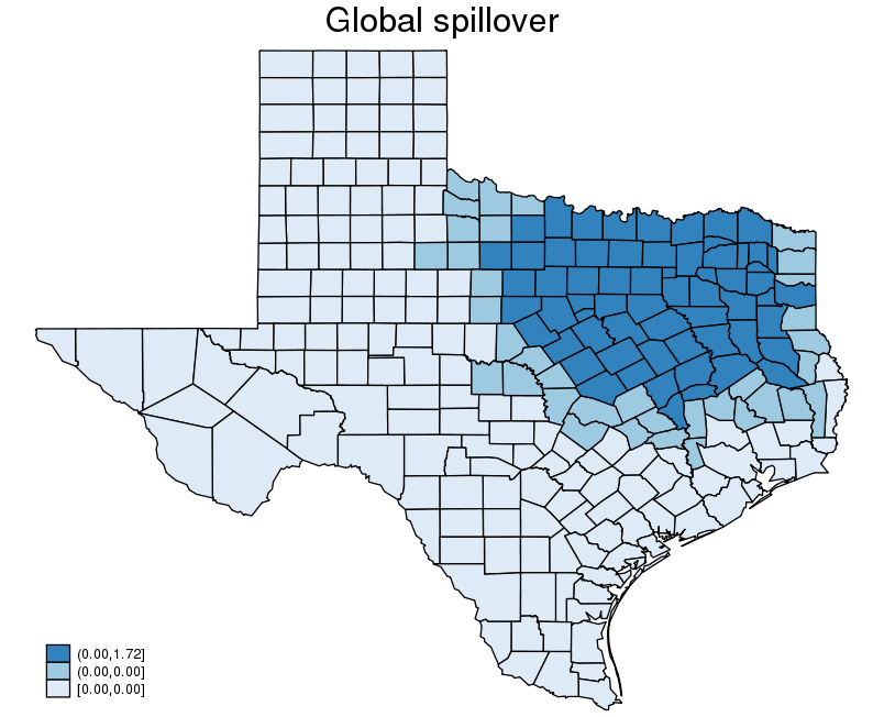
The above graph shows that a change in the unemployment rate in Dallas changes the homicide rates in the counties that are near to Dallas, in addition to the homicide rate in Dallas. The change in Dallas spills over to the nearby counties, and the effect is known as a spillover effect.
SAR model and spatial spillover
In this section, I show why a SAR model generates a spillover effect. In the process, I provide a formula for this effect that I use to create the animated graph.
The matrix form for a SAR model is
\[\begin{align} {\bf y} &= \lambda {\bf W} {\bf y} + {\bf X}\beta + \epsilon \end{align} \]
Solving for \({\bf y}\) yields
\[ \begin{align} {\bf y} &= ({\bf I} – \lambda {\bf W})^{-1} {\bf X}\beta + \epsilon
\end{align} \]
The mean value of \({\bf y}\) given a value of \({\bf X}\) is known as the the expectation of \({\bf y}\) conditional on \({\bf X}\). Because \(\epsilon\) is independent of \({\bf X}\), the expectation of \({\bf y}\) conditional on \({\bf X}\) is
\[\begin{align} E({\bf y}|{\bf X}) &= ({\bf I} – \lambda {\bf W})^{-1} {\bf X}\beta \end{align} \]
Note that this conditional expectation specifies the mean for each county in Texas because \({\bf y}\) is a vector.
We use this equation to define the effect of going from one set of values for \({\bf X}\) to another set. In the case at hand, I let \({\bf X_0}\) contain the covariate values in the observed data and let \({\bf X_1}\) contain the same values except that the unemployment rate in Dallas has been set to 10%. With this notation, I see that going from \({\bf X_0}\) to \({\bf X_1}\) causes the mean homicide rates for each county in Texas to change by
\[ \begin{align} E({\bf y}|{\bf X_1}) – E({\bf y}|{\bf X_0}) &= ({\bf I} – \lambda {\bf W})^{-1} {\bf X_1} \beta – ({\bf I}- \lambda {\bf W})^{-1} {\bf X_0} \beta \nonumber \\ &=({\bf I} – \lambda {\bf W})^{-1} \Delta {\bf X} \beta \tag{1} \end{align} \]
where \(\Delta {\bf X}= {\bf X_1} – {\bf X_0}\).
I now show that a technical condition assumed in SAR models produces an expression for the animated graph. SAR models are widely used because they satisfy a stability condition. Intuitively, this stability condition says that the inverse matrix \(({\bf I} – \lambda {\bf W})^{-1}\) can be written as a sum of terms that decrease in size exponentially fast. This condition is that
\[ \begin{align} ({\bf I} – \lambda {\bf W})^{-1} &= ({\bf I} + \lambda {\bf W} + \lambda^2 {\bf W}^2 + \lambda^3 {\bf W}^3 + \ldots) \tag{2} \end{align} \]
Plugging the formula from (2) into the effect in (1) yields
\[ \begin{align} E({\bf y}|{\bf X_1}) – E({\bf y}|{\bf X_0}) &= ({\bf I} – \lambda {\bf W})^{-1} \Delta {\bf X} \beta \nonumber \\ &= ({\bf I} + \lambda {\bf W} + \lambda^2 {\bf W}^2 + \lambda^3 {\bf W}^3 + \ldots)\Delta {\bf X} \beta \nonumber \\ &= \Delta {\bf X} \beta + \lambda {\bf W} \Delta {\bf X}\beta + \lambda^2 {\bf W}^2 \Delta {\bf X}\beta + \lambda^3 {\bf W}^3 \Delta {\bf X} \beta + \ldots \tag{3} \end{align} \]
which is the expression for the effect that I use to generate the animated graph.
Each term in (3) has some intuition, which is most easily presented in terms of my example. The first term (\(\Delta {\bf X}\beta\)) is the initial effect of the change, and it affects only the homicide rate in Dallas. The second term (\(\lambda {\bf W} \Delta {\bf X}\beta\)) is the effect of the change on the outcome in those places that are neighbors of Dallas. The third term (\(\lambda^2 {\bf W}^2 \Delta {\bf X}\beta\)) is the effect of the change on the outcome in those places that are neighbors of neighbors of Dallas. The intuition continues in the pattern for the remaining terms.
Create animated graphs for spillover effects
I now describe how I generate the animated graph. Each graph plots the change using a subset of the terms in (3). The first graph plots the change computed from the first term only. The second graph plots the change computed from the first and second terms only. The third graph plots the change computed from the first three terms only. And so on.
The first four steps of the code do the following.
-
It computes and plots \(\Delta {\bf X}\beta\).
-
It computes and plots \(\Delta {\bf X} \beta + \lambda {\bf W} \Delta {\bf X}\beta\).
-
It compute and plots \(\Delta {\bf X} \beta + \lambda {\bf W} \Delta {\bf X}\beta + \lambda^2 {\bf W}^2 \Delta {\bf X}\beta\).
-
It computes and plots \(\Delta {\bf X} \beta + \lambda {\bf W} \Delta {\bf X}\beta + \lambda^2 {\bf W}^2 \Delta {\bf X}\beta + \lambda^3 {\bf W}^3 \Delta {\bf X} \beta\).
Steps 5 through 20 perform the analogous operations.
Finally, combine graphs from step 1 to step 20, and create an animated graph.
Here is the code that implements this process.
  1 /* get estimate of spatial lag parameter lambda */
  2 local lambda = _b[W:hrate]
  3
  4 /* xb based on original data */
  5 predict xb0, xb
  6
  7 /* xb based on modified data */
  8 replace unemployment = 10 if cname == "Dallas"
  9 predict xb1, xb
 10
 11 /* compute the outcome change in the first step */
 12 generate dy = xb1 - xb0
 13 format dy %9.2f
 14
 15 /* Initialize Wy, lamWy, */
 16 generate Wy = dy
 17 generate lamWy = dy
 18
 19 /* map the outcome change in step 1 */
 20 grmap dy
 21 graph export dy_0.png, replace
 22 local input dy_0.png
 23
 24 /* compute the outcome change from step 2 to 11 */
 25 forvalues p=1/20 {
 26         spgenerate tmp = W*Wy
 27         replace lamWy = `lambda'^`p'*tmp
 28         replace Wy = tmp
 29         replace dy = dy + lamWy
 30         grmap dy
 31         graph export dy_`p'.png, replace
 32         local input `input' dy_`p'.png
 33         drop tmp
 34 }
 35
 36 /* convert graphs into a animated graph */
 37 shell convert -delay 150 -loop 0 `input' glsp.gif
 38
 39 /* delete the generated pgn file */
 40 shell rm -fR *.png
This code uses the ereturn results produced by spregress above and its corresponding predict command.
Line 2 puts the estimate of \(\lambda\) in the local macro lambda.
Lines 5, 7, 8, and 9 compute \({\bf X}\beta\) for \({\bf X_0}\) and \({\bf X_1}\) and store them in xb0 and xb1, respectively.
Line 12 computes the first term (\(\Delta {\bf X}\beta\)) and stores it in dy.
Lines 16 and 17 store the initial values for \({\bf W}^{p} {\bf y}\) and \(\lambda^{p} {\bf W}^{p} {\bf y}\), when \(p=0\).
Lines 20–22 produce the first plot in the animated graph. The local macro input will contain all the plots used to create the animated graph when the code finishes.
Lines 25–34 compute the terms and create the plots for the remaining terms. Line 26 uses spgenerate to compute \({\bf W}^{p} {\bf y}\). Line 27–33 perform operations analogous to those of dy.
In Line 37, I use a Linux tool “convert” to combine the graphs to produce an animated graph. On Windows, I can use software such as FFmpeg and Camtasia. For more details, see How to create animated graphics using Stata by Chuck Huber.
Line 40 deletes all the unnecessary .png files.
Here is the animated graph created by this code.

Done and undone
In this post, I discussed spillover effects and why SAR models produce them in the context of an example using the counties in Texas. I also showed how the effects can be computed as an accumulated sum. I used the accumulated sum to create an animated graph that illustrates how the effects spill over in the counties in Texas.