Customizable tables in Stata 17, part 3: The classic table 1
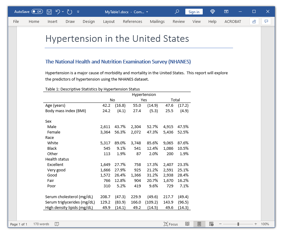
In my last two posts, I showed you how to use the new-and-improved table command to create a table and how to use the collect commands to customize and export the table. In this post, I want to show you how to use these tools to create a table of descriptive statistics that is often called a “classic table 1”. Our goal is to create the table in the Microsoft Word document below.
Create the basic table
Let’s begin by typing webuse nhanes2l to open the NHANES dataset and use table to create the table from my previous blog posts. I have included the nototal option to remove the row totals from the table.
. webuse nhanes2l
(Second National Health and Nutrition Examination Survey)

. table (var) (highbp),
>       statistic(fvfrequency sex )
>       statistic(fvpercent sex)
>       statistic(mean age)
>       statistic(sd age)
>       nototal

----------------------------------------------------
                            |   High blood pressure
                            |          0           1
----------------------------+-----------------------
Sex=Male                    |
  Factor variable frequency |      2,611       2,304
  Factor variable percent   |      43.70       52.65
Sex=Female                  |
  Factor variable frequency |      3,364       2,072
  Factor variable percent   |      56.30       47.35
Age (years)                 |
  Mean                      |   42.16502    54.97281
  Standard deviation        |   16.77157    14.90897
----------------------------------------------------
Recall that table automatically creates a collection and that we can type collect dims to view the dimensions in our collection.
. collect dims

Collection dimensions
Collection: Table
-----------------------------------------
                   Dimension   No. levels
-----------------------------------------
Layout, style, header, label
                      cmdset   1
                     colname   3
                     command   1
                      highbp   2
                      result   4
                     statcmd   4
                         var   3

Header, label
                         sex

Style only
                border_block   4
                   cell_type   4
-----------------------------------------
The dimension result was created by the statistic() options in our table command. Let’s type collect label list result to view the levels and labels of the dimension result.
. collect label list result, all

  Collection: Table
   Dimension: result
       Label: Result
Level labels:
 fvfrequency  Factor variable frequency
   fvpercent  Factor variable percent
        mean  Mean
          sd  Standard deviation
The output tells us that result has four dimensions: fvfrequency, fvpercent, mean, and sd. By default, these levels are stacked on top of each other in our table, and I would like to place them side by side. Let’s use collect recode to create two new levels named column1 and column2. Then, we can place the information from fvfrequency and mean in column1 and the information from fvpercent and sd in column2.
. collect recode result fvfrequency = column1
>                       fvpercent   = column2
>                       mean        = column1
>                       sd          = column2
(18 items recoded in collection Table)
Let’s type collect label list result to view the new levels we created for the dimension result.
. collect label list result, all

  Collection: Table
   Dimension: result
       Label: Result
Level labels:
     column1
     column2
 fvfrequency  Factor variable frequency
   fvpercent  Factor variable percent
        mean  Mean
          sd  Standard deviation
The output tells us that the dimension result now includes the levels column1 and column2 in addition to the other levels.
Next, we can use collect layout to change the layout of our table. The row dimension is still var, and the first column dimension is still highbp. We can nest column1 and column2 under highbp by specifying the column dimension as highbp#result[column1 column2]. Note the # operator between highbp and result[column1 column2]. The dimension result has six levels, but we want to include only the levels column1 and column2. So we enclose the levels we want to include in brackets.
. collect layout (var) (highbp#result[column1 column2])

Collection: Table
      Rows: var
   Columns: highbp#result[column1 column2]
   Table 1: 3 x 4

--------------------------------------------------------
            |             High blood pressure
            |           0                     1
            |   column1    column2    column1    column2
------------+-------------------------------------------
Sex=Male    |      2611   43.69874       2304   52.65082
Sex=Female  |      3364   56.30126       2072   47.34918
Age (years) |  42.16502   16.77157   54.97281   14.90897
--------------------------------------------------------
Create a larger table
Now that we have the basic layout of our table, let’s add some additional variables. We can include multiple variables in a statistic() option. For example, I have included both age and bmi in the first statistic() option. I would like age and bmi to appear first in our table, sex, race, and hlthstat to appear next, followed by tcresult, tgresult, and hdresult. The order of the rows is determined by the order of the statistic() options. I have included the nototal option again to reduce the width of the table in this blog post, but I removed the nototal option to create the final table in the Microsoft Word document below.
. table (var) (highbp),
>       statistic(mean age bmi)
>       statistic(sd   age bmi)
>       statistic(fvfrequency sex race hlthstat)
>       statistic(fvpercent   sex race hlthstat)
>       statistic(mean tcresult tgresult hdresult)
>       statistic(sd   tcresult tgresult hdresult)
>       nototal

(output omitted)
I have used collect recode again to create levels column1 and column2 for the dimension result. And I have used collect layout again to change the layout of our table.
. collect recode result fvfrequency = column1
>                       fvpercent   = column2
>                       mean        = column1
>                       sd          = column2
(60 items recoded in collection Table)

. collect layout (var) (highbp#result[column1 column2])

Collection: Table
      Rows: var
   Columns: highbp#result[column1 column2]
   Table 1: 15 x 4

------------------------------------------------------------------------
                            |             High blood pressure
                            |           0                     1
                            |   column1    column2    column1    column2
----------------------------+-------------------------------------------
Age (years)                 |  42.16502   16.77157   54.97281   14.90897
Body mass index (BMI)       |  24.20231   4.100279   27.36081   5.332119
Sex=Male                    |      2611   43.69874       2304   52.65082
Sex=Female                  |      3364   56.30126       2072   47.34918
Race=White                  |      5317   88.98745       3748   85.64899
Race=Black                  |       545   9.121339        541   12.36289
Race=Other                  |       113   1.891213         87   1.988117
Health status=Excellent     |      1649   27.65387        758    17.3376
Health status=Very good     |      1666   27.93896        925   21.15737
Health status=Good          |      1572   26.36257       1366   31.24428
Health status=Fair          |       766   12.84588        904   20.67704
Health status=Poor          |       310   5.198725        419   9.583715
Serum cholesterol (mg/dL)   |  208.7272   47.28725   229.8798   49.58294
Serum triglycerides (mg/dL) |  129.2284   83.92955   166.0427   109.1998
High density lipids (mg/dL) |  49.94449   14.14055   49.21784   14.54068
------------------------------------------------------------------------
Customize the display of numbers
Now we can customize the style of our table. Let’s begin by customizing the display of the numbers. In my previous posts, we formatted the numbers using the nformat() and sformat() options in our table command. We can also use these options with collect style cell. We may wish to apply different formats to different cells in the table, and collect style cell uses dimensions and levels to refer to cells in a table.
The first line in the output below is a good example. We would like to format the frequencies for our factor variables. Therefore, we want to format cells in the table that meet two conditions. The first condition is that the row dimension var has level sex, race, or hlthstat. The second condition is that the column dimension result has level column1. We want to format only cells that meet both conditions so we use the # operator to specify the intersection of those two conditions. And we can use nformat(%6.0fc) to display those cells with no digits to the right of the decimal and include a comma in the thousands position.
The second line in the output below formats the percentages. These are cells where var has level sex, race, or hlthstat and where result has level column2. We can use nformat(%6.1f) to display those cells with one digit to the right of the decimal and use sformat(“%s%%”) to place % after the number.
The third line in the output below formats the means and standard deviations. These are cells where var has level age, bmi, tcresult, tgresult, or hdresult and where result has level column1 or column2. We can use nformat(%6.1f) to display those cells with one digit to the right of the decimal.
The fourth line in the output below formats the standard deviations. These are cells where var has level age, bmi, tcresult, tgresult, or hdresult and where result has level column2. We can use sformat(“(%s)”) to place parentheses around the number.
Finally, we can type collect preview to view the changes to the table.
. collect style cell var[sex race hlthstat]#result[column1], nformat(%6.0fc)

. collect style cell var[sex race hlthstat]#result[column2],
>         nformat(%6.1f) sformat("%s%%")

. collect style cell
>         var[age bmi tcresult tgresult hdresult]#result[column1 column2],
>         nformat(%6.1f)

. collect style cell
>         var[age bmi tcresult tgresult hdresult]#result[column2],
>         sformat("(%s)")

. collect preview

--------------------------------------------------------------------
                            |           High blood pressure
                            |          0                   1
                            |  column1   column2   column1   column2
----------------------------+---------------------------------------
Age (years)                 |     42.2    (16.8)      55.0    (14.9)
Body mass index (BMI)       |     24.2     (4.1)      27.4     (5.3)
Sex=Male                    |    2,611     43.7%     2,304     52.7%
Sex=Female                  |    3,364     56.3%     2,072     47.3%
Race=White                  |    5,317     89.0%     3,748     85.6%
Race=Black                  |      545      9.1%       541     12.4%
Race=Other                  |      113      1.9%        87      2.0%
Health status=Excellent     |    1,649     27.7%       758     17.3%
Health status=Very good     |    1,666     27.9%       925     21.2%
Health status=Good          |    1,572     26.4%     1,366     31.2%
Health status=Fair          |      766     12.8%       904     20.7%
Health status=Poor          |      310      5.2%       419      9.6%
Serum cholesterol (mg/dL)   |    208.7    (47.3)     229.9    (49.6)
Serum triglycerides (mg/dL) |    129.2    (83.9)     166.0   (109.2)
High density lipids (mg/dL) |     49.9    (14.1)      49.2    (14.5)
--------------------------------------------------------------------
Customize the column labels
Next, let’s customize the column labels in our table using commands that we learned in my second blog post. The first line in the output below uses collect label dim to change the label of the dimension highbp to “Hypertension”. The second line in the output below uses collect label levels to label the level 0 “No” and the level 1 “Yes”.
The third line in the output below uses collect style header to hide the levels of dimension result in the column header. This removes column1 and column2 from the column header.
. collect label dim highbp "Hypertension", modify

. collect label levels highbp 0 "No" 1 "Yes"

. collect style header result, level(hide)

. collect preview

---------------------------------------------------------------
                            |            Hypertension
                            |        No               Yes
----------------------------+----------------------------------
Age (years)                 |   42.2   (16.8)    55.0    (14.9)
Body mass index (BMI)       |   24.2    (4.1)    27.4     (5.3)
Sex=Male                    |  2,611    43.7%   2,304     52.7%
Sex=Female                  |  3,364    56.3%   2,072     47.3%
Race=White                  |  5,317    89.0%   3,748     85.6%
Race=Black                  |    545     9.1%     541     12.4%
Race=Other                  |    113     1.9%      87      2.0%
Health status=Excellent     |  1,649    27.7%     758     17.3%
Health status=Very good     |  1,666    27.9%     925     21.2%
Health status=Good          |  1,572    26.4%   1,366     31.2%
Health status=Fair          |    766    12.8%     904     20.7%
Health status=Poor          |    310     5.2%     419      9.6%
Serum cholesterol (mg/dL)   |  208.7   (47.3)   229.9    (49.6)
Serum triglycerides (mg/dL) |  129.2   (83.9)   166.0   (109.2)
High density lipids (mg/dL) |   49.9   (14.1)    49.2    (14.5)
---------------------------------------------------------------
Customize the row labels
Next, let’s customize the row labels in our table. The first line in the output below uses collect style row to change several things. The argument stack stacks the categories of the levels on top of each other rather than side by side. For example, Male and Female are placed below the level label Sex. The nobinder option removes the = that previously appeared between each level and its categories. And the spacer option adds a space between levels created with different statistic() options.
The second line in the output below uses collect style cell to remove the vertical line from the table. Recall from my last post that the vertical line is a border along the right side of the first column in the table. The option border(right, pattern(nil)) changes the line pattern to nil.
. collect style row stack, nobinder spacer

. collect style cell border_block, border(right, pattern(nil))

. collect preview

-------------------------------------------------------------
                                       Hypertension
                                   No               Yes
-------------------------------------------------------------
Age (years)                   42.2   (16.8)    55.0    (14.9)
Body mass index (BMI)         24.2    (4.1)    27.4     (5.3)

Sex
  Male                       2,611    43.7%   2,304     52.7%
  Female                     3,364    56.3%   2,072     47.3%
Race
  White                      5,317    89.0%   3,748     85.6%
  Black                        545     9.1%     541     12.4%
  Other                        113     1.9%      87      2.0%
Health status
  Excellent                  1,649    27.7%     758     17.3%
  Very good                  1,666    27.9%     925     21.2%
  Good                       1,572    26.4%   1,366     31.2%
  Fair                         766    12.8%     904     20.7%
  Poor                         310     5.2%     419      9.6%

Serum cholesterol (mg/dL)    208.7   (47.3)   229.9    (49.6)
Serum triglycerides (mg/dL)  129.2   (83.9)   166.0   (109.2)
High density lipids (mg/dL)   49.9   (14.1)    49.2    (14.5)
-------------------------------------------------------------
Export the table to a Microsoft Word document
I’m happy with the layout of our table, and I’m ready to export it to a Microsoft Word document. Let’s use putdocx to add a title, section header, and some text to our document before we insert the table.
Next, we can use collect style putdocx to add a title to our table. By default, Microsoft Word will stretch our table to fit the width of the document. We can use the layout(autofitcontents) option to retain the original width of the table.
Finally, we can use putdocx collect to export our table to the document. I have used a red font in the code block below to emphasize the lines that customize and export the graph.
Note that the graph in the document below includes columns labeled “Total”. I removed those columns in the examples above so that the tables would not exceed the default width for this blog post. I have simply removed the nototals option from the table command to add the “Total” columns to the table in the Microsoft Word document.
putdocx begin

putdocx paragraph, style(Title)

putdocx text ("Hypertension in the United States")

putdocx paragraph, style(Heading1)

putdocx text ("The National Health and Nutrition Examination Survey (NHANES)")

putdocx paragraph

putdocx text ("Hypertension is a major cause of morbidity and mortality in ")

putdocx text ("the United States.  This report will explore the predictors ")

putdocx text ("of hypertension using the NHANES dataset.")

collect style putdocx, layout(autofitcontents)                          ///

title("Table 1: Descriptive Statistics by Hypertension Status")

putdocx collect

putdocx save MyTable1.docx, replace
Conclusion
In this blog post, we used many of the tools we learned about in my last two posts. We used table with the statistic() option to create our basic table, then used collect label to modify the labels of dimensions and levels, collect style row to customize the row labels, and collect style cell to remove the vertical line. And we used collect style putdocx and putdocx collect to customize and export our table to a Microsoft Word document.
We also learned how to use some new collect commands in this post. We learned how to use collect recode to recode levels of a dimension, how to use collect layout to change the layout of our table, and how to use collect style cell to format the numbers in our tables.
I will show you how to create a table of statistical tests in my next post.