How to create animated choropleth maps using the COVID-19 data from Johns Hopkins University
10 April 2020
No comments
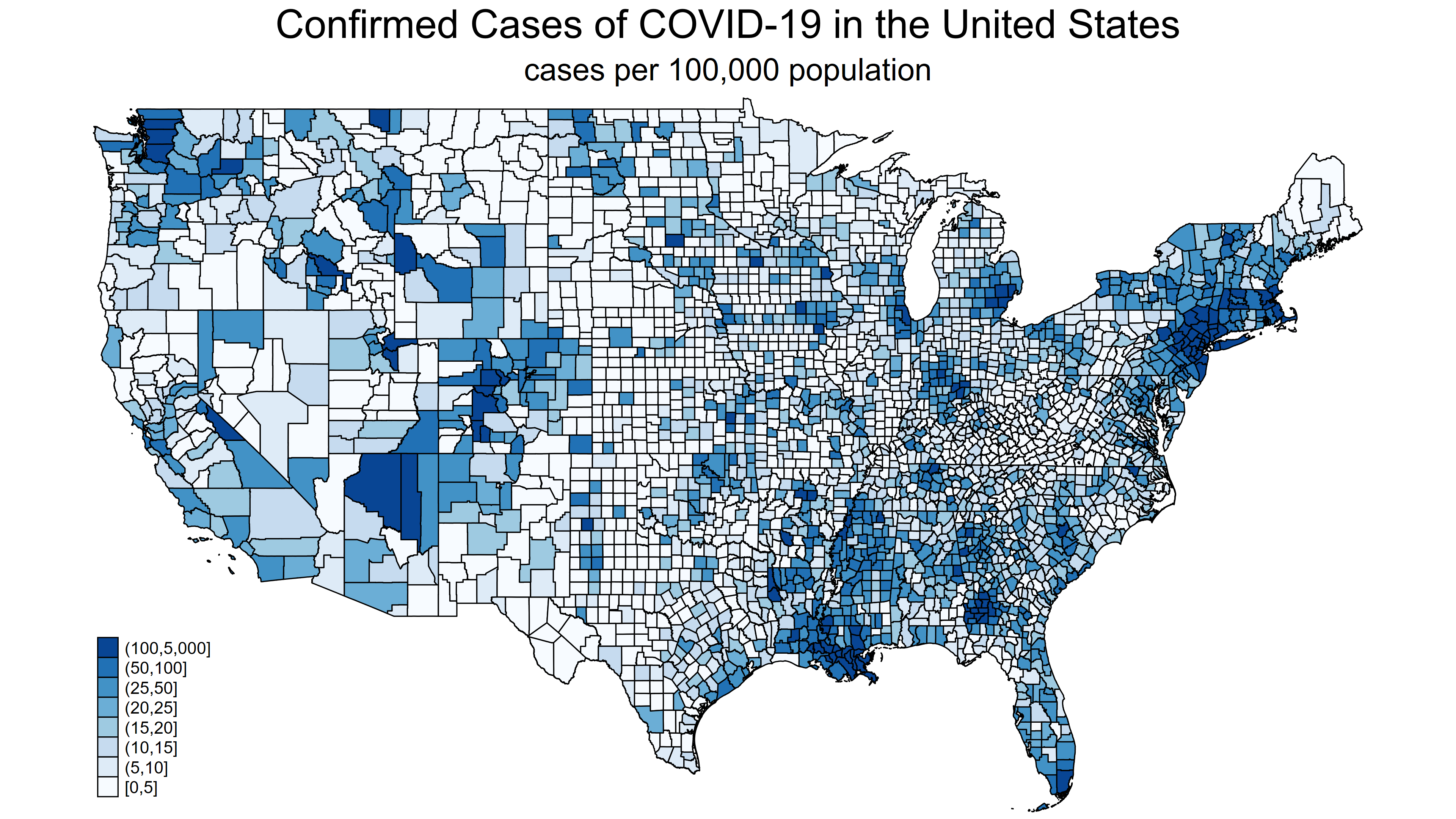
In my previous posts, I showed how to download the COVID-19 data from the Johns Hopkins GitHub repository, graph the data over time, and create choropleth maps. Now, I’m going to show you how to create animated choropleth maps to explore the distribution of COVID-19 over time and place.
The video below shows the cumulative number of COVID-19 cases per 100,000 population for each county in the United States from January 22, 2020, through April 5, 2020. The map doesn’t change much until mid-March, when the virus starts to spread faster. Then, we can see when and where people are being infected. You can click on the “Play” icon on the video to play it and click on the icon on the bottom right to view the video in full-screen mode.