Adding recession shading to time-series graphs
Introduction
Sometimes, I like to augment a time-series graph with shading that indicates periods of recession. In this post, I will show you a simple way to add recession shading to graphs using data provided by import fred. This post also demostrates how to build a complex graph in Stata, beginning with the basic pieces and finishing with a polished product.
The National Bureau of Economic Research (NBER) defines a recession as “a significant decline in economic activity spread across the economy, lasting more than a few months, normally visible in real GDP, real income, employment, industrial production, and wholesale–retail sales.” The NBER maintains a list of turning-point months in which the “peaks” and “troughs” in business activity occurred. A recession is the time between a peak and a trough. As of February 2020, the list of recession dates is located at http://www.nber.org/cycles/cyclesmain.html.
The Federal Reserve Economic Database (FRED), maintained by the Federal Reserve Bank of St. Louis, contains time-series data on thousands of economic indicators from GDP and employment to exchange rates and trade flows. It also contains some utility series, one of which happens to be an indicator variable that indicates whether a given month or quarter belongs to an NBER–defined recession. We will use the import fred command to pull the FRED data directly into Stata.
Finding and importing the data
I first add recession shading to a plot of the unemployment rate. To import the data, I need to know the FRED code for the unemployment rate. I could look it up online, or I could search with the FRED GUI, or I could search using the fredsearch command. Most of the time, I would use the GUI, but for this post I search for it with fredsearch. The command takes a list of keywords as its arguments, so typing
. fredsearch headline unemployment rate
searches for all series in the database that match all the keywords “headline”, “unemployment”, and “rate”. More keywords will narrow a search; fewer keywords will pick up more series.
. fredsearch headline unemployment rate
--------------------------------------------------------------------------------
Series ID          Title                  Data range                Frequency
--------------------------------------------------------------------------------
CPIAUCSL           Consumer Price Ind...  1947-01-01 to 2019-12-01  Monthly
UNRATE             Unemployment Rate      1948-01-01 to 2020-01-01  Monthly
PAYEMS             All Employees, Tot...  1939-01-01 to 2020-01-01  Monthly
USSLIND            Leading Index for ...  1982-01-01 to 2019-12-01  Monthly
CCSA               Continued Claims (...  1967-01-07 to 2020-01-25  Weekly, Endi
> ng Saturday
--------------------------------------------------------------------------------
Total: 5
My search produced five results. It looks like UNRATE is the intended target. I confirm this suspicion with another fredsearch:
. fredsearch UNRATE, detail
--------------------------------------------------------------------------------
UNRATE
--------------------------------------------------------------------------------
Title:                Unemployment Rate
Source:               U.S. Bureau of Labor Statistics
Release:              Employment Situation
Seasonal adjustment:  Seasonally Adjusted
Data range:           1948-01-01 to 2020-01-01
Frequency:            Monthly
Units:                Percent
Last updated:         2020-02-07 07:47:02-06
Notes:                The unemployment rate represents the number of unemploy...
--------------------------------------------------------------------------------
Total: 1
The detail option provides more detail about the matches found by fredsearch.
Next, I need the series that contains the recession indicator. I perform another fredsearch, this time hunting for nber recession.
. fredsearch nber recession, tags(usa monthly)
--------------------------------------------------------------------------------
Series ID          Title                  Data range                Frequency
--------------------------------------------------------------------------------
USREC              NBER based Recessi...  1854-12-01 to 2020-01-01  Monthly
USRECM             NBER based Recessi...  1854-12-01 to 2020-01-01  Monthly
USRECP             NBER based Recessi...  1854-12-01 to 2020-01-01  Monthly
USARECM            OECD based Recessi...  1947-02-01 to 2019-12-01  Monthly
USAREC             OECD based Recessi...  1947-02-01 to 2019-12-01  Monthly
USARECP            OECD based Recessi...  1947-02-01 to 2019-12-01  Monthly
--------------------------------------------------------------------------------
Total: 6
The tags() option restricts the results of the search to series that match the tags. Judicious use of keywords and tags narrows down the results considerably. I use the usa tag to restrict my search to U.S. data and the monthly tag to restrict my search to series with a monthly frequency. I chose a monthly frequency because the unemployment data are reported monthly—see the detail output above. Three series look like they might fit: USREC, USRECM, and USRECP. I choose USRECM because, after a bit more searching, I find that it’s the one that the St. Louis Fed uses.
I import the two series.
. import fred UNRATE USRECM

Summary
--------------------------------------------------------------------------------
Series ID                    Nobs    Date range                Frequency
--------------------------------------------------------------------------------
UNRATE                       865     1948-01-01 to 2020-01-01  Monthly
USRECM                       1982    1854-12-01 to 2020-01-01  Monthly
--------------------------------------------------------------------------------
# of series imported: 2
   highest frequency: Monthly
    lowest frequency: Monthly
The import fred command imports each FRED code listed. It also provides two utility variables, datestr and daten. datestr is a string date variable, while daten is a numeric (daily) date variable. The summary table provides information about each series: the identification code, the number of observations, the date range, and the observation frequency.
A graph with recession shading
Before plotting, I need to run some data management commands. First, I drop all observations for which the unemployment rate is missing. The recession indicator runs from 1854 to the present, while the unemployment series runs only from 1948 to the present. Second, I generate a few useful time variables from the daten variable. Third, I add concise labels to the unemployment rate and recession variables.
. keep if UNRATE < .
(1,117 observations deleted)

. generate datem = mofd(daten)

. tsset datem, monthly
        time variable:  datem, 1948m1 to 2020m1
                delta:  1 month

. label variable UNRATE "Unemployment Rate"

. label variable USRECM "Recession"
The generate datem = mofd(daten) command produces a Stata time variable. The tsset command declares the data to be time-series data. Finally, the label variable command attaches labels to the variables.
Let's draw a preliminary graph of the unemployment rate with tsline:
. tsline UNRATE
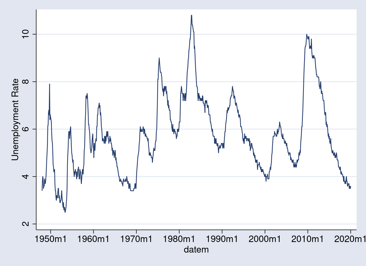
This initial graph simply plots the unemployment rate with all default graph options. The data range goes from about 3% to a little over 10%.
Next, let's draw a preliminary graph of the recession periods. The twoway area plot shades the area underneath a curve, so using it on the recession indicator variable shades the recessions.
. twoway area USRECM datem
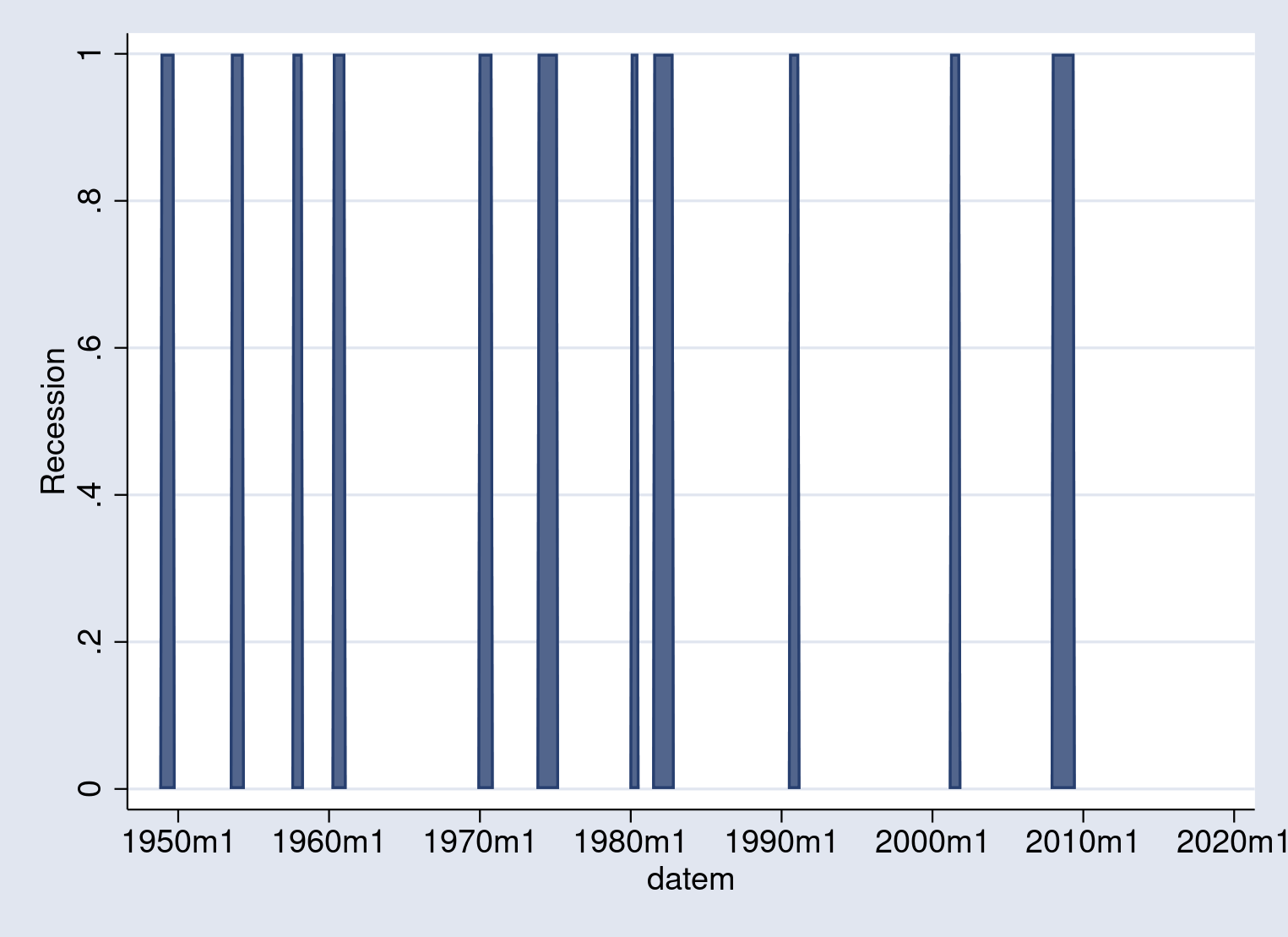
The indicator is 1 if the economy is in recession during the month, and 0 otherwise. From the previous two graphs, the main idea becomes clear: to add recession shading to a graph, simply overlay the unemployment rate plot on top of the recession shading area plot.
We can combine the two graphs. But before doing so, we need to stretch the recession indicator so that the height of the recession bars covers the range of the unemployment rate data. Because the unemployment rate data range from 3 to about 10, I'll stretch the recession indicator to equal 12 during a recession:
. replace USRECM = 12*USRECM
(133 real changes made)
Multiplying the recession indicator by 12 transforms it from a 0–1 variable into a 0–12 variable. Now, it will stretch across the full range of unemployment rates.
Now, we can combine the plots using twoway with each plot bound by ().
. twoway (area USRECM datem) (tsline UNRATE)
The first line is our area plot; the second line is our line plot. Stata stacks the graphs from first to last, so that the first plot you specify ends up in the background, while the last plot you specify ends up in the foreground. The output looks like this:
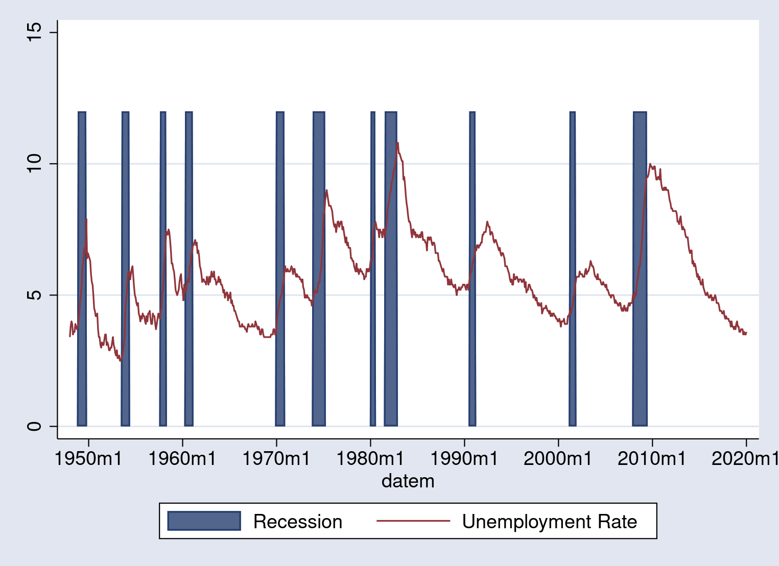
This graph shows off the idea, but the shading is too dark and the axis labels need work. Fortunately, graph twoway has a wide suite of options available to modify the appearance of the graph.
The last step is to make aesthetic adjustments to the graph to improve readability. We change the scheme to select our preferred overall look, and then we modify individual elements of the graph. We use options within twoway area to change the color of the shaded area; these details are changed by specifying the color() option. I choose a light-gray shading, gs14. We use options within tsline to change the appearance of the unemployment rate plot; in particular, the line color is controlled by the lcolor() option. I choose a blue line. Options specified outside the individual plots will affect the entire graph. I adjust the axis titles with xtitle() and ytitle() and adjust the labels with tlabel() and ylabel(). When I am done, the command to run is
. set scheme s1color

. twoway  (area USRECM datem,   color(gs14))
>         (tsline UNRATE,       lcolor(blue)),
>         ytitle("Unemployment rate")  xtitle("")
>         ylabel(0(3)12) tlabel(, format(%tmCCYY))
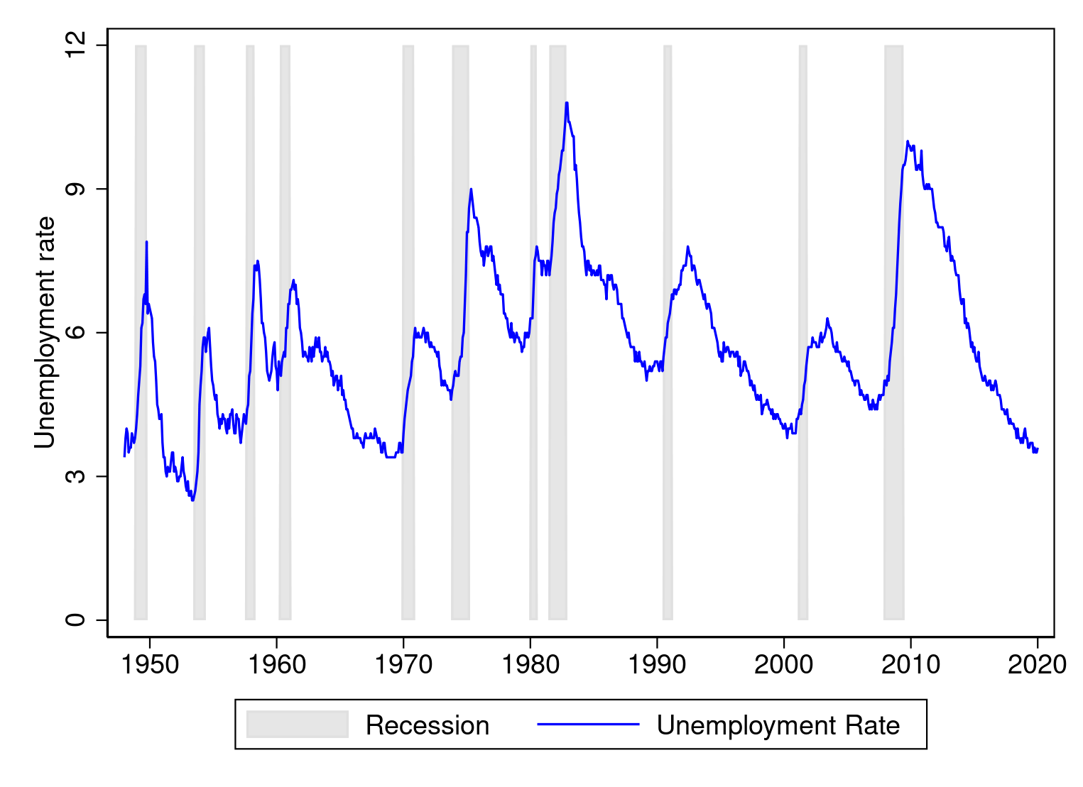
Much better. Graphics commands can get complex. Stata has a "type a little, get a little; type a lot, get a lot" philosophy. The more you type, the more control you have over the appearance of the graph.
Another example: Graphs with positive and negative values
As a second example, I add recession shading to a graph of U.S. GDP growth. The FRED code for U.S. real GDP growth is A191RO1Q156NBEA. GDP growth data are quarterly, so we use the quarterly recession indicator variable, which is USRECQM.
I import the data and perform the necessary cleanup.
. import fred A191RO1Q156NBEA USRECQM

Summary
--------------------------------------------------------------------------------
Series ID                    Nobs    Date range                Frequency
--------------------------------------------------------------------------------
A191RO1Q156NBEA              288     1948-01-01 to 2019-10-01  Quarterly
USRECQM                      661     1854-10-01 to 2019-10-01  Quarterly
--------------------------------------------------------------------------------
# of series imported: 2
   highest frequency: Quarterly
    lowest frequency: Quarterly

. generate dateq   = qofd(daten)

. tsset dateq, quarterly
        time variable:  dateq, 1854q4 to 2019q4
                delta:  1 quarter
The import fred command imported the data, the generate dateq = qofd(daten) command generated a date variable, and the tsset command declared the data to be time-series data.
The default name of the GDP growth variable is cumbersome, so I rename it. I also give the series a nice label and drop any missing observations.
. rename A191RO1Q156NBEA growth

. label variable growth "real GDP growth"

. keep if growth < .
(373 observations deleted)
The next thing is to set the bounds of the recession shade area. In the previous section, we summarized the unemployment rate and set the bounds manually. This time, I summarize the growth variable and use some of the summarize command's returned results to set the bounds automatically. I create a new variable, recession, that holds a value equal to the maximum growth rate when USRECQM equals one and holds the minimum growth rate when USRECMQ equals zero. Hence, the area shaded will range vertically from the minimum to the maximum observed GDP growth rate.
. summarize growth

    Variable |        Obs        Mean    Std. Dev.       Min        Max
-------------+---------------------------------------------------------
      growth |        288    3.192361    2.565466       -3.9       13.4

. generate recession = r(max) if USREC == 1
(236 missing values generated)

. replace  recession = r(min) if USREC == 0
(236 real changes made)
Let's draw our graph with recession shading, following the same strategy as before:
. twoway  (area recession dateq,    color(gs14))
>         (tsline growth,           lcolor(blue)),
>         xtitle("") ytitle("GDP growth rate, %")
The output is
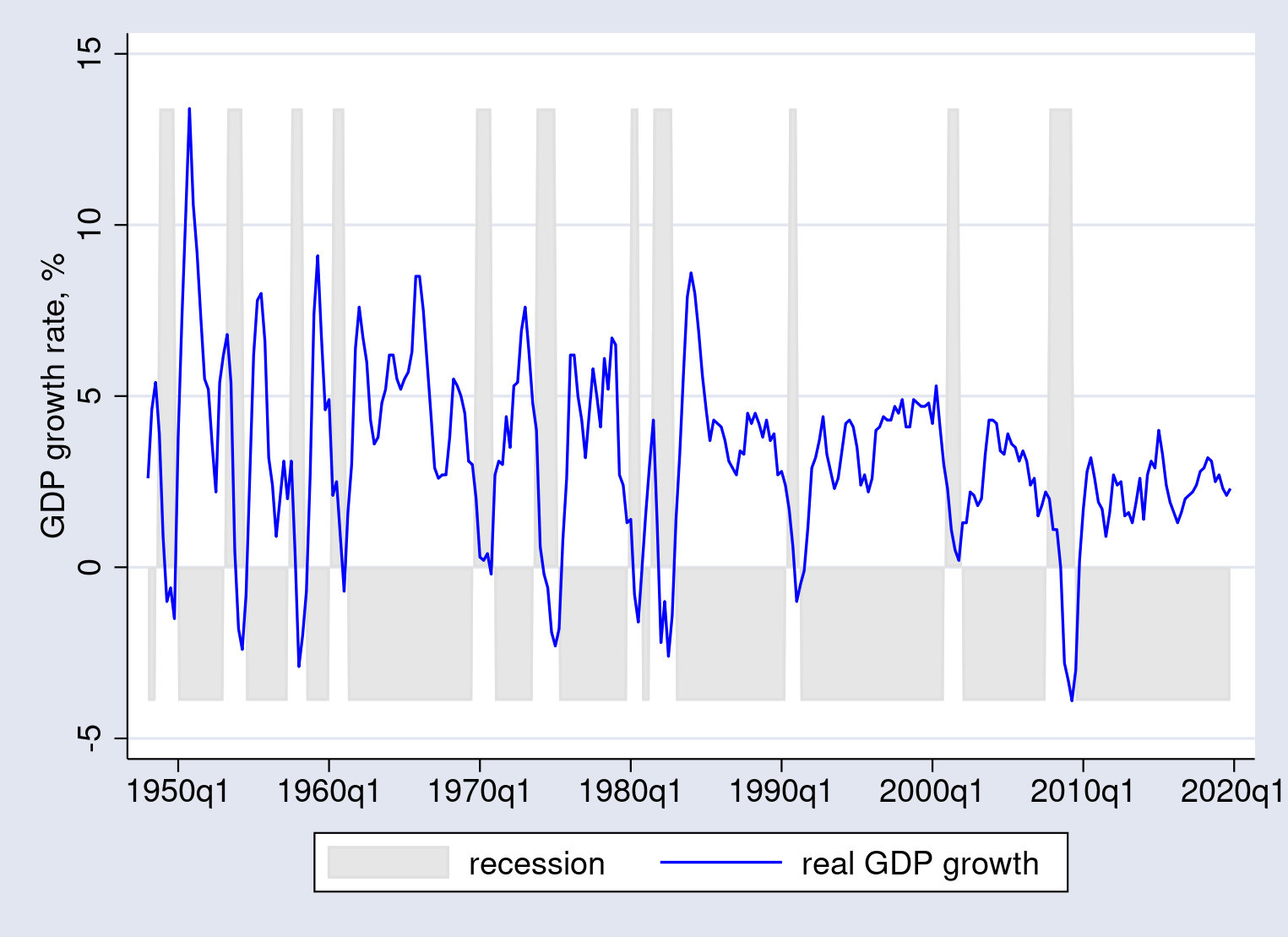
That doesn't look right. The behavior of twoway area is to fill in the area from the edge of the graph to the origin, which in our case means that it fills from the top down during recessions but also from the bottom up during expansions. The way to fix it is to use the base() option in twoway area.
The base() option selects the value to drop to. Let's summarize growth again and this time store the value of the minimum in a local macro, min.
. summarize growth

    Variable |        Obs        Mean    Std. Dev.       Min        Max
-------------+---------------------------------------------------------
      growth |        288    3.192361    2.565466       -3.9       13.4

. local min = r(min)
We'll use the value stored in min when graphing. Alternatively, we could have looked at the output and manually copied the minimum value into the graph.
With the base value in hand, let's try again.
. set scheme s1color

. twoway  (area recession dateq,   color(gs14)  base(`min'))
>         (tsline growth,       lcolor(blue)),
>         xtitle("") ytitle("GDP growth rate, %")
>         tlabel(, format(%tqCCYY))
Notice that I have specified the option base(`min') in the first line, within the area graph command. The output is
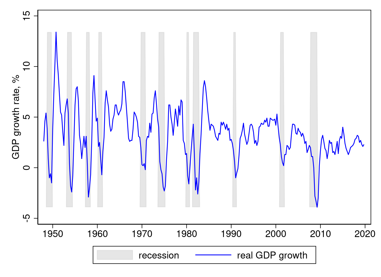
This looks correct. Substantively, recessions mark off periods of lower-than-usual GDP growth. Not all recessions are associated with negative GDP growth; for example, growth slowed but did not turn negative during the 2001 recession. The recession of 2007–2009 is clearly visible, with deeply negative growth during 2008.
Conclusion
FRED provides a time-series marking U.S. recessions. You can import it as an indicator variable into Stata, then use that indicator variable to draw recession shading in a time-series graph. I demonstrated how to import series using fredsearch and import fred and how to build a complicated graph out of simpler pieces.
Replication code
I walked you through a few commands that did not work to show you when and why to use various options. The essential commands of the session were
clear all

import fred UNRATE USRECM

keep if UNRATE < .
generate datem = mofd(daten)
tsset datem, monthly
label variable UNRATE "Unemployment Rate"
label variable USRECM "Recession"

replace USRECM = 12*USRECM

twoway (area USRECM datem, color(gs14))               ///
       (tsline UNRATE,    lcolor(blue)),              ///
       xtitle("") ytitle("Unemployment rate")         ///
       ylabel(0(3)12) tlabel(, format(%tmCCYY))
clear all

import fred A191RO1Q156NBEA USRECQM
generate dateq = qofd(daten)
tsset dateq, quarterly

rename A191RO1Q156NBEA growth
label variable growth "real GDP growth"
keep if growth < .

summarize growth
generate recession = r(max) if USREC == 1
replace recession  = r(min) if USREC == 0
local min = r(min)

set scheme s1color
twoway (area recession dateq, color(gs14) base(‘min’))   ///
       (tsline growth,  lcolor(blue)),                   ///
       xtitle("") ytitle("GDP growth rate, %")           ///
       tlabel(, format(%tqCCYY))