Stata Press is pleased to announce the release of Interpreting and Visualizing Regression Models Using Stata, Second Edition by Michael N. Mitchell.
Mitchell’s latest book is a clear treatment of how to carefully present results from model-fitting in a wide variety of settings. It is a boon to anyone who has to present the tangible meaning of a complex model clearly, regardless of the audience. Read more…
Categories: New Books, Resources, Stata Products Tags: books, contrasts, forthcoming, graphics, interaction, interpreting, linear regression, logistic regression, michael mitchell, mitchell, nonlinear, regression models, release, second, social science, Stata 16, stata press, statistics, visualizing
In my previous post, we learned how to use the Stata Function Interface (SFI) module to copy data from Stata to Python. In this post, I will show you how to use the SFI module to copy data from Python to Stata. We will be using the yfinance module to download financial data from the Yahoo! finance website. You can install this module in your Python environment by typing pip install yfinance. Our goal is to use Python to download historical data for the Dow Jones Industrial Average (DJIA) and use Stata to create the following graph. Read more…
Update (14 January 2021): Stata’s Apple Silicon support has been fully tested on M1 Macs and is no longer in beta.
Update (23 November 2020): We stated earlier that nonuniversal versions of
Stata/MP would not run on Macs with Apple Silicon. This was based on our experience with attempting to run a nonuniversal version of Stata/MP on an Apple developers kit that contained an A14 SOC (system on chip) instead of an M1 SOC. However, we have since obtained a production Mac Mini with an M1 SOC and have found that nonuniversal versions of Stata/MP will in fact run on Macs with Apple Silicon.
Apple has announced the first set of Macs that are transitioning to Apple Silicon. Apple claims that Macs with Apple Silicon promise better performance and longer battery life than the previous generations of Macs. This will be of great interest to our Stata-for-Mac users, many of whom use Mac laptops.
Read more…
In my previous posts, I used the read_stata() method to read Stata datasets into pandas data frames. This works well when you want to read an entire Stata dataset into Python. But sometimes we wish to read a subset of the variables or observations, or both, from a Stata dataset into Python. In this post, I will introduce you to the Stata Function Interface (SFI) module and show you how to use it to read partial datasets into a pandas data frame. Read more…
Machine learning, deep learning, and artificial intelligence are a collection of algorithms used to identify patterns in data. These algorithms have exotic-sounding names like “random forests”, “neural networks”, and “spectral clustering”. In this post, I will show you how to use one of these algorithms called a “support vector machines” (SVM). I don’t have space to explain an SVM in detail, but I will provide some references for further reading at the end. I am going to give you a brief introduction and show you how to implement an SVM with Python.
Our goal is to use an SVM to differentiate between people who are likely to have diabetes and those who are not. We will use age and HbA1c level to differentiate between people with and without diabetes. Age is measured in years, and HbA1c is a blood test that measures glucose control. The graph below displays diabetics with red dots and nondiabetics with blue dots. An SVM model predicts that older people with higher levels of HbA1c in the red-shaded area of the graph are more likely to have diabetes. Younger people with lower HbA1c levels in the blue-shaded area are less likely to have diabetes. Read more…
Data are everywhere. Many government agencies, financial institutions, universities, and social media platforms provide access to their data through an application programming interface (API). APIs often return the requested data in a JavaScript Object Notation (JSON) file. In this post, I will show you how to use Python to request data with API calls and how to work with the resulting JSON data. Read more…
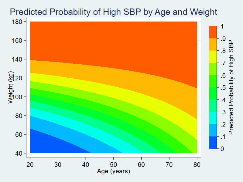
In my first four posts about Stata and Python, I showed you how to set up Stata to use Python, three ways to use Python in Stata, how to install Python packages, and how to use Python packages. It might be helpful to read those posts before you continue with this post if you are not familiar with Python. Now, I’d like to shift our focus to some practical uses of Python within Stata. This post will demonstrate how to use Stata to estimate marginal predictions from a logistic regression model and use Python to create a three-dimensional surface plot of those predictions.
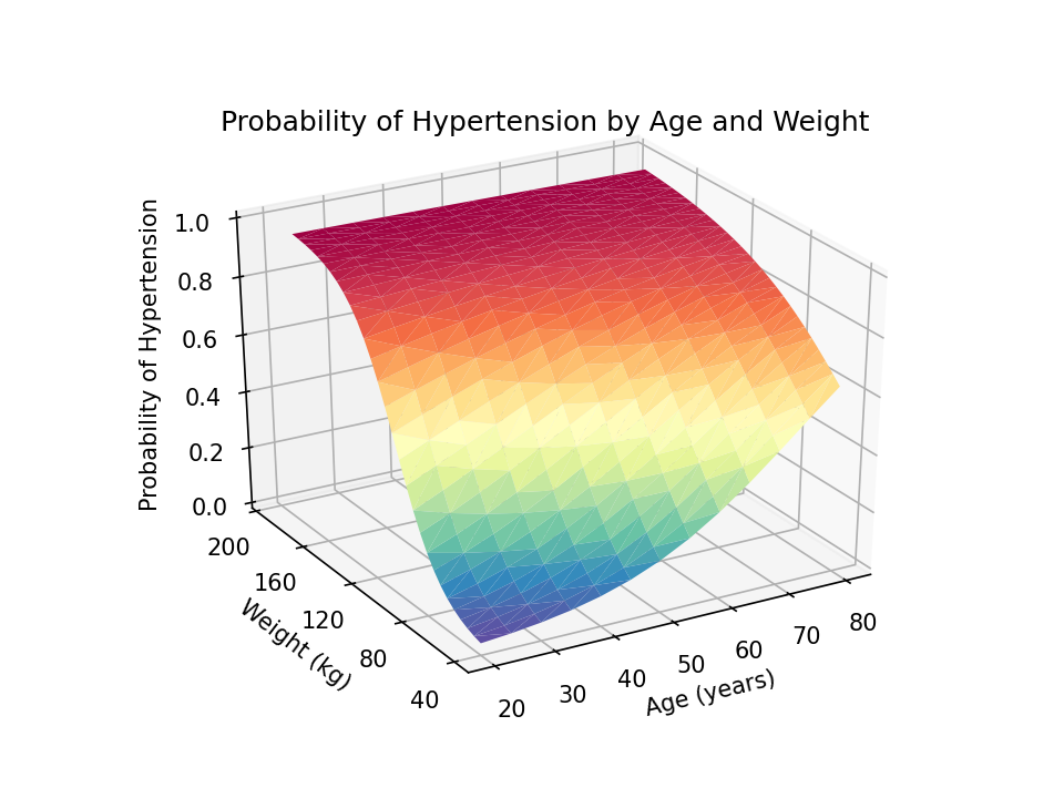
Read more…
In my last post, I showed you how to use pip to install four popular packages for Python. Today I want to show you the basics of how to import and use Python packages. We will learn some important Python concepts and jargon along the way. I will be using the pandas package in the examples below, but the ideas and syntax are the same for other Python packages. Read more…
In my last post, I showed you three ways to use Python within Stata. The examples were simple but they allowed us to start using Python. At this point, you could write your own Python programs within Stata. But the real power of Python lies in the thousands of freely available packages. Today, I want to show you how to download and install Python packages. Read more…
In my last post, I showed you how to install Python and set up Stata to use Python. Now, we’re ready to use Python. There are three ways to use Python within Stata: calling Python interactively, including Python code in do-files and ado-files, and executing Python script files. Each is useful in different circumstances, so I will demonstrate all three. The examples are intentionally simple and somewhat silly. I’ll show you some more complex examples in future posts, but I want to keep things simple in this post. Read more…